
Astro vs JSX — What are the Differences?
 12 min read
Astro's syntax is a superset of HTML that looks very familiar to JSX. However, there are a few key differences between JSX and Astro. In this tutorial, we'll take a look at how Astro's templating syntax compares to JSX, what the similarities, and what the differences are.

Variables and Expressions
To make Astro templates dynamic, Astro supports the use of variables and expressions inside its templates, just like JSX. We can define variables inside the component script for components. These can then be used in the template itself:
---
const notification = 'You have unread messages.'
---

<p>{notification}</p>To inject variables into the template, we can use curly braces, just like in JSX. In this example, the notification will be injected between the p tags. Of course, we can also write expressions in the component script to dynamically create variables for our templates:
---
const getMessages = () => 1 + 1
const notification = `You have ${getMessages()} unread messages.`
---

<p>{notification}</p>Using string interpolation, we make the variable dynamic. Now the message will also show the number of unread messages, using a mock function that returns 2. We can also use expressions right inside Astro templates. For example, the following achieves the same, but the expression is created in the template:
---
const getMessages = () => 1 + 1
---

<p>You have {getMessages()} unread messages.</p>This dynamic behavior enables us to create dynamic attributes. In a production setting, we might want to customize the behavior of a component based on the presence of props. Let's say we need a dynamic class. We can achieve it by passing the prop to the attribute like so:
---
const { type } = Astro.props
---

<p class={type}>You have unread messages.</p>Note that Astro uses the class attribute instead of className.
In this example, if the type variable is undefined, the class will be omitted from the output. However, if it has a value, a class attribute will be added to the paragraph with the value of type. The same behavior is true for other attributes. They'll only be present if the passed variable has a value.
Dynamic Classes
In Astro, there's also a special directive called class:list that allows us to dynamically attach class names to elements. This is useful if we need to conditionally add multiple class names. Take the following as an example:
The class:list directive expects an array of various values. It's powered by the popular clsx library, so its functionality directly matches how the library behaves.
clsx is a tiny utility library for constructing class names conditionally.
In the above example, we passed a string, a variable, and an object. It automatically filters falsy (false, null, or undefined) values. Therefore, if type doesn't have a value, it'll not be added to the class. The directive can also accept an object, in which case, the object's key (in our case show) will be applied if its value is true. The final output of the above example will be:
<p class="notification show" />In React, this functionality is often replicated by another popular library called classNames. To create the same functionality, we would have to write the following in React, with an explicit import of the third-party library:
import classNames from 'classnames';

export const Notification = ({ type }) => {
    return (
        <p className={classNames([
            'notification',
            type,
            { show: true }
        ])} />
    )
}
 Remove ads
Conditions and Loops
In the previous example, we rendered a notification message. However, if the notification variable is empty, Astro will render an empty p tag on the page. We can get around this using conditions. The syntax for conditions is the same as JSX:
---
const notification = 'You have unread messages.'
---

{notification && (
    <p>{notification}</p>
)}In this case, the p tag will only be rendered if the value of the notification variable evaluates to true. Another commonly used technique for conditions is using either a ternary or a logical OR. For example, if we need to render another message in case there are no notifications, it could be achieved in the following way:
---
const notification = 'You have unread messages.'
---

<!-- Using a ternary -->
<p>
    {notification
        ? notification
        : 'You have no unread messages'
    }
</p>

<!-- Using a logical OR -->
<p>{notification || 'You have no unread messages'}</p>When it comes to using loops in Astro, it uses the same syntax as JSX, except Astro doesn't require the use of the key prop. This slightly simplifies the syntax of loops. See how the same loop compares in React vs. Astro:
<!-- Loop in Astro: -->
{items.map(item => (
    <li>{item}</li>
))}

<!-- Loop in React: -->
{items.map((item, index) => (
    <li key={index}>{item}</li>
))}Dynamic Elements
It's also important to point out that we can build dynamic elements in Astro using either strings or assigning components to variables. The following code will render an h1 or an h2 depending on the type prop:
---
const { type } = Astro.props
const Heading = type === 'title' ? 'h1' : 'h2'
---

<Heading>This will be either a heading or a subheading</Heading>If the type prop equals "title", an h1 will be rendered on the page. Otherwise, it'll be an h2. Note that in this case, we need to capitalize the variable to make it behave as a custom element. Otherwise, it'll be treated as a regular HTML tag. We can follow the same logic for imported components:
---
import Alert from '../components/Alert.astro'
import Info from '../components/Info.astro'

const { type } = Astro.props
const Notification = type === 'alert' ? Alert : Info
---
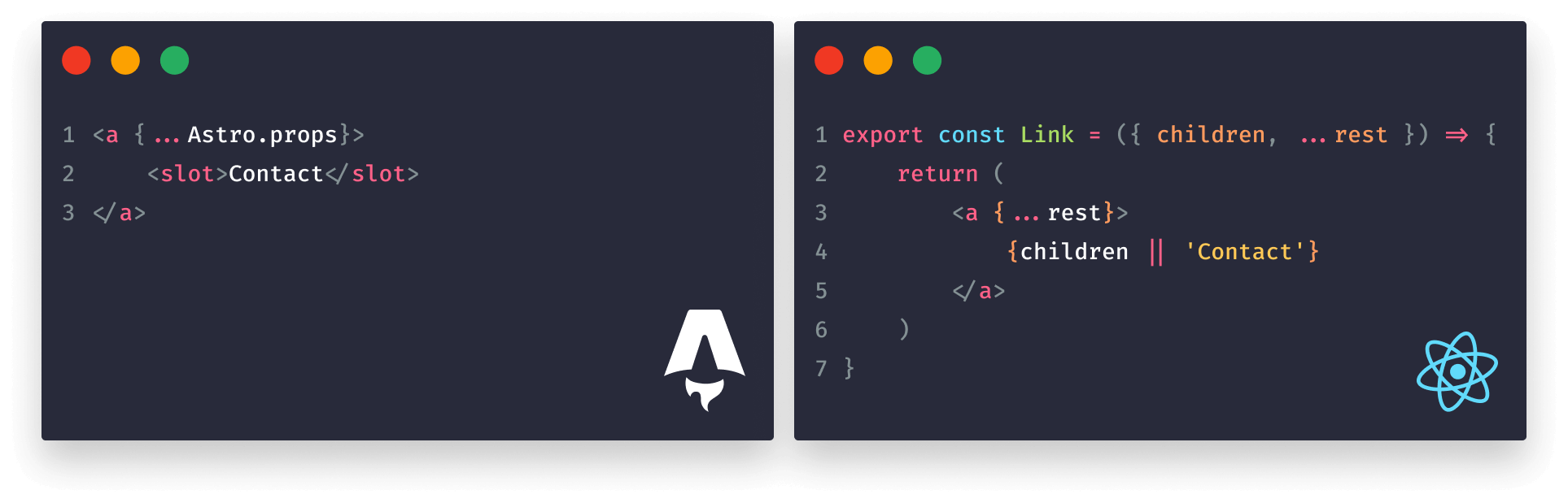
<Notification />We can pass around components just like variables. In this case, we don't need to use </> when referencing the components inside the component script. If we need to pass props to a dynamic component, we'll need to assign them in the component template, either one by one or by using the spread operator:
---
import Alert from '../components/Alert.astro'
import Info from '../components/Info.astro'

const { type } = Astro.props
const Notification = type === 'alert' ? Alert : Info
const props = {
    type,
    title: 'Notification'
}
---

<!-- We can pass them explicitly -->
<Notification type={props.type} title={props.title} />

<!-- Or we can use the spread operator -->
<Notification {...props} />While the second approach provides a cleaner syntax, it comes at the cost of readability, as now we can't see which props are being passed to the component. A good rule of thumb is to pass props explicitly and only use the spread operator if you're dealing with large sets of props.
It's also worth mentioning that we can reference an object's property as a component too. This is especially useful if we need to dynamically call components using a loop. For example, the following will create a Heading, a Notification, and a Text component:
---
import Heading from '../components/Heading.astro'
import Notification from '../components/Notification.astro'
import Text from '../components/Text.astro'

const items = [
    {
        component: Heading,
        props: { ... }
    },
    {
        component: Notification,
        props: { ... }
    },
    {
        component: Text,
        props: { ... }
    }
]
---

{items.map(item => <item.component {...item.props} />)}- Lines 8, 12, 16: We pass the imported components to the
componentproperty on the object. This way, we can later reference them as methods inside the loop. - Lines 9, 13, 17: We can optionally also create a
propsobject where we can add the necessary properties for each component. - Line 22: Inside the loop, we need to reference
item.componentwhich will returnHeading,Notification, orText, depending on the iteration. Using a spread operator, we can pass all props to the dynamically created components.
Should we need to pass any children elements, we can also do that by introducing a ternary operator inside the loop:
---
const items = [
    {
        component: Heading,
        props: { ... },
        children: 'This text will go between the Heading component'
    },
    { ... }
]
---

{items.map(item => item.children
    ? <item.component {...item.props}>
          <Fragment set:html={item.children} />
      </item.component>
    : <item.component {...item.props} />
)}How Astro Differs from JSX?
Based on these examples, Astro is very similar to JSX. However, there are some differences that we have to keep in mind, starting with how attributes are treated.
Attribute syntax
Unlike in JSX, where attributes use a camelCase format, Astro uses kebab-case, just like in regular HTML. This means that we need to write attributes as we would in HTML. We can use hyphens, and we need to use the HTML class attribute instead of className:
<!-- Astro -->
<p class="notification" data-tooltip="Astro uses standard HTML attributes" />

<!-- JSX -->
<p className="notification" dataTooltip="JSX uses camelCase" />However, when using props and special attributes on components, we still need to follow camelCase naming. In the following example, we cannot use hyphens:
<Card
    subTitle="..."
    metaDescription="..."
/>Using fragments
Fragments also work differently in Astro compared to JSX. When we need to return multiple elements in React, we need to wrap them in a fragment to avoid DOM pollution. This happens because, in JSX, we must only return one element:
<React.Fragment>
    <span className="tooltip">...</span>
    <div className="tooltip-backdrop" />
</React.Fragment>

{/* Or */}
<Fragment>
    <span className="tooltip">...</span>
    <div className="tooltip-backdrop" />
</Fragment>

{/* Or */}
<>
    <span className="tooltip">...</span>
    <div className="tooltip-backdrop" />
</>For this, we can use either React.Fragment, Fragment or <> for a shorthand. This syntax is not necessary in Astro components; we can return as many sibling elements as necessary.
However, Astro has a built-in Fragment component (not to be confused with a React fragment) that works differently compared to fragments in React. Fragments in Astro can be used to inject HTML as strings into templates:
---
const html = '<h1>This will be rendered as HTML</h1>'
---

<Fragment set:html={html} />In order to do so, these fragments use the set:html directive that can be used in conjunction with the built-in Fragment component. This directive can be used with other elements too; it works like setting innerHTML. For example, if we need to inject HTML into a standard HTML element, we can attach the same directive:
---
const html = '<li>HTML from string</li>'
---

<ul set:html={html} />The value passed to set:html is not automatically escaped, so make sure to sanitize it to avoid XSS attacks.
Event handling
Event handling also works differently in Astro. In React, events are usually handled by an onClick prop, just like in the following example:
However, Astro templates are static by default, meaning we cannot create state in the same way we do in React components. Instead, we need to use vanilla JavaScript inside a script tag, which will be scoped to the component. The above can be rewritten in the following way in Astro:
<h1>0</h1>
<button>Increase</button>

<script>
    const button = document.querySelector('button')
    const h1 = document.querySelector('h1')

    button.addEventListener('click', () => {
        h1.innerText = String(Number(h1.innerText) + 1)
    })
</script>- Lines 5-6: We first grab both HTML elements using query selectors.
- Lines 8-10: We set up a click event listener on the button.
- Line 9: The text of the
h1is changed usinginnerText. We need to first parseinnerTextto a number usingNumber(h1.innerText), increase it by one, and then convert it back to a string.
Multiple comment syntax
Last but not least, Astro also supports the use of HTML comments, unlike JSX. Both JSX-style and regular HTML comments can be used in Astro components. The difference between them is that HTML comments will be preserved in production builds, whereas JSX comments will be removed.
{/* Astro support JSX comments (removed from build) */}
<!-- As well as HTML comments (not removed from build) -->Summary
In summary, Astro highly resembles JSX to make the learning curve seamless for developers coming from React, and this also simplifies migration processes. Using Astro-specific directives and components like class:list or Fragment takes JSX's functionality one step further and provides more flexibility out of the box, without compromising on readability.
Do you have experience working with Astro and JSX? Let us know your thoughts in the comments! If you'd also like to learn more about how JSX compares to vanilla JavaScript, make sure to check out the tutorial below. Thank you for reading through; happy coding!

 Access 100+ interactive lessons
- Unlimited access to hundreds of tutorials
- Prepare for technical interviews
Courses


Recommended

How to Work With Event Listeners in Astro
11 min read
How to Work With CSS in Astro
9 min read
The Building Blocks of Astro Components
6 min read