How to Create Skeleton Loaders in CSS
 2021 11 November •
  5 min read
Motion plays an important role in any application. It can help you to make interfaces more expressive and intuitive, whilst also providing key information, such as feedback that can guide a user’s attention to important parts of your page.
When it comes to loading animations, motion can also play a big part in improving perceived performance. With the right balance of speed, direction, or easing, motion can make loading feel more performant.

How Skeleton Loaders Improve Perceived Performance
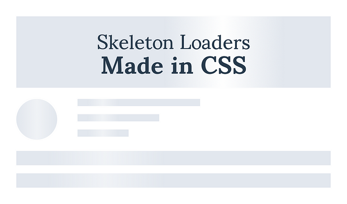
A good example of perceived performance enhancement occurs in skeleton loaders. A skeleton loader can act as a placeholder for information that is still loading, helping the user focus on progress instead of wait times.
This is what we’ll look at creating in this article. We will look at improving the loading animation of a dashboard from a simple loading spinner to a placeholder loading animation, and eventually, turn:

The Loading Animation Explained
The animation is quite simple yet very effective. We want to animate a gradient from left to right. We also want to make sure the gradient goes over its container to disappear, before starting all over again.
When thinking about motion, we should usually aim for a duration somewhere between 300–500ms. Anything below this duration, animations become too fast to perceive; anything above can feel sluggish, making users feel they are waiting more than they actually are. It’s also important to note that the more complex and larger the animation, the slower it should be. Just like larger objects in the real world move at a slower pace.
In the gif above, the animation takes over 2 seconds to complete, making the application’s performance feel laggy. Therefore, we’ll go for a shorter duration. However, because of its large dimensions, we may still end up over 500ms.
We also want to make use of a nice easing to make the animation feel more natural. Nothing in the real world moves at a constant, linear pace. To fully understand how the animation will work, the best way is to explain it through another animation:
Animating a gradient

Here we’re animating a gradient from left to right, starting from outside of the container. To break it down:
- Starting position: The gradient is positioned out of view, with its right side touching the beginning of the fixed container.
- Start with a negative offset: The gradient position starts with a negative value, matching its width. So if the gradient’s width is 150px, its initial value will be
left: -150px;. - Hide the gradient: To prevent showing it outside its container we will also need to specify
overflow: hidden;. - Reset the animation: After the animation is complete, the gradient position is reset to the beginning.

 Remove ads
Writing The CSS for the Loader
From the HTML side, we will only be working with a single placeholder element. Let it be:
<div class="placeholder-item"></div>The whole animation will go inside a ::before element. This is a pseudo-element that is often used to add cosmetics to the selected element. Think of pseudo-element as an added keyword to a selector that lets you style specific parts of it. But before taking care of it, let’s define some styles for the parent:
.placeholder-item {
    box-shadow: 0 4px 10px 0 rgba(33, 33, 33, 0.15);
    border-radius: 4px;
    height: 200px;
    position: relative;
    overflow: hidden;
}The important rules defined above are the last two lines. We will position the ::before element absolutely to its container, so the placeholder item needs to have a relative position and its overflow set to hidden. This will prevent the gradient from showing outside of our placeholder element. Moving on to the ::before pseudo-element:
Using a pseudo-element
.placeholder-item::before {
    content: '';
    display: block;
    position: absolute;
    left: -150px;
    top: 0;
    height: 100%;
    width: 150px;
    background: linear-gradient(to right, transparent 0%, #E8E8E8 50%, transparent 100%);
    animation: load 1s cubic-bezier(0.4, 0.0, 0.2, 1) infinite;
}Let’s analyze the code of this pseudo-element:
- As you can see, since the width of the gradient is 150px, its initial value should be -150px to the left.
- Another important part is the background property. You want to go from transparent into transparent to perfectly blend it into the background of its container. The color of the gradient is specified exactly at 50%.
- And for the
loadanimation, you’ll need to modify theleftproperty:
With everything in place, this will result in the following animation:
Summary
When dealing with subtle animations, you can see that implementing them shouldn’t be much work. Yet the user experience they provide outweighs the time and effort that goes into them.
If you also change the fixed width of the gradient to a percentage, you’ll also be able to reuse the animation on different shapes and sizes. You only need to write it once, then use it as you like.
What are your favorite animations when it comes to loading? Let us know in the comments. Thank you for reading through, happy styling. 🎨


Rocket Launch Your Career
Speed up your learning progress with our mentorship program. Join as a mentee to unlock the full potential of Webtips and get a personalized learning experience by experts to master the following frontend technologies:
Courses

CSS - The Complete Guide (including Flexbox, Grid and Sass)

The HTML & CSS Bootcamp

The Creative HTML5 & CSS3 Course
Recommended
10 Critical Performance Optimization Steps You Should Take
2023 22 May • 10 min read
How to Secure Your API With JSON Web Tokens
2021 11 November • 9 min read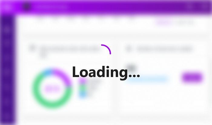
How to Lazy Load Images With Intersection Observer
2021 11 November • 6 min read