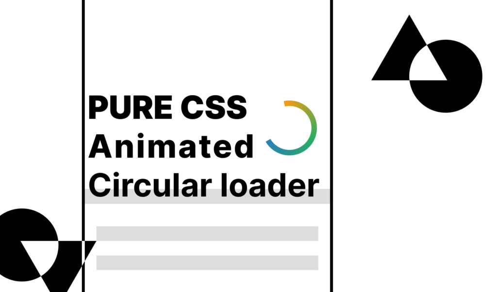
How to Create a Material Circle Loader in CSS
 2022 05 July •
  5 min read
Progress indicators, circular loader, or shortly, spinners are used to indicate processes, statuses, or the state of an application. Think of submitting a form, or waiting for a video to be loaded. They are great indicators to communicate that there is an action that is taking place and that something is about to load. They can be either determinate or indeterminate; either we know how long an operation will take, or we don’t.
In this tutorial, we are going to take a look at how to create the classic indeterminate material circle loader in CSS. At the end of the tutorial, you will have the following loader ready for you to use:
Get the full source code from Codepen
Set up the DOM
First, let’s quickly set up the necessary HTML tags. We’re going to need a wrapper and an SVG element with a circle tag:
<div class="loader">
    <svg class="circular-loader" viewBox="25 25 50 50">
        <circle class="loader-path" cx="50" cy="50" r="20" fill="none"></circle>
    </svg>
</div>For SVGs, the viewBox property defines the positions and dimensions of the viewport of an SVG. A great way to understand the viewBox property of SVG elements is an interactive guide, written by Amelia Wattenberger.
The circle tag will generate the circle for us, with the following properties:
cx: Specifies the x-axis coordinate for the center of the circlecy: Specifies the y-axis coordinate for the center of the circler: Specifies the radius for the circle
Right now, this should generate a black circle on your screen, like the one below:
Turning the Circle Into a Stroke
To turn the circle into a stroke, add the following rules to your circle tag:
.loader-path {
    fill: none;
    stroke: green;
    stroke-width: 3px;
    stroke-linecap: round;
}This will remove the default black fill color, and adds a green stroke that is 3px wide. Having round line caps is also a nice touch. They are used for defining the shape at the end of open subpaths.

 Remove ads
Animating the Loader
The animation is made up of two parts. First, the whole SVG is rotated around its center at a constant pace. To make the rotation visible, add the following rule temporarily to your path:
.loader-path {
    stroke-dasharray: 10, 10;
}Then add a new @keyframes animation that rotates the whole SVG around, and add this as an animation to the circular-loader class, that is attached to the SVG:
@keyframes rotate {
    100% {
        transform: rotate(360deg);
    }
}

.circular-loader {
    animation: rotate 2s linear infinite;
}This will rotate the SVG in 360 degrees under two seconds. It’s important to set the easing to linear to make the speed constant. To make it play indefinitely, simply add infinite to your animation property.
Animating the stroke
Now it’s time to animate the stroke to achieve the material loader effect. You can remove the temporarily added stroke-dasharray property from loader-path, as this is what we will animate over time. To animate the stroke, add this new @keyframes animation to your CSS:
@keyframes animate-stroke {
    0% {
        stroke-dasharray: 1, 200;
        stroke-dashoffset: 0;
        stroke: red;
    }
    50% {
        stroke-dasharray: 89, 200;
        stroke-dashoffset: -35;
        stroke: green;
    }
    100% {
        stroke-dasharray: 89, 200;
        stroke-dashoffset: -124;
        stroke: blue;
    }
}

.loade-path {
    animation: animate-stroke 1.5s ease-in-out infinite;
}This will make the stroke to start out with a small length, and animate itself into an almost completely full circle. The stroke-dashoffset sets the offset for the dasharray, so the rendering of the stroke is always started from another place. Lastly, you can change the color of the stroke to give it some extra visual effects.
This animation is played out infinitely under 1.5 seconds, and this time, set the easing to ease-in-out. If you put this animation together with the rotated SVG, you get the below effect:
On the left, the SVG is not rotated around its axis, only the stroke animation is active, while on the right, both animations are enabled.
Summary
You can play around with the speed of the animations as well as the easing, or the stroke-dasharray and stroke-dashoffset properties to achieve different effects.
As mentioned in the beginning, you can play around with the whole code on Codepen. The example also contains some CSS variables so you can configure some of the variables more easily. Thank you for reading through, happy animating!

Rocket Launch Your Career
Speed up your learning progress with our mentorship program. Join as a mentee to unlock the full potential of Webtips and get a personalized learning experience by experts to master the following frontend technologies:
Courses

CSS - The Complete Guide (including Flexbox, Grid and Sass)

The HTML & CSS Bootcamp

The Creative HTML5 & CSS3 Course
Recommended
How to Create Custom Tasks in VSCode
2021 19 July • 3 min read
How to Publish Your First NPM Package
6 min read
How to Bundle your React-Electron App by Parcel
2021 02 August • 8 min read