
Simple Ways to Fake Masonry in CSS
 2021 17 July •
  8 min read
Masonry is a common grid layout for galleries, portfolios, or blog posts which consists of columns, and variable height rows. Items are placed after each other where vertical space is available for them. Therefore, they don’t necessarily laid out in order. Their dimensions can dictate, where each element needs to be placed in a grid.
It’s a popular technique for optimizing available space on a site and minimizing the amount of gaps between elements. This layout has been long easily achievable with a JavaScript library, called Masonry. In this tutorial, however, we will look at a purely CSS implementation, without any JavaScript involved.

Why Dynamic Masonry Can’t Be Achieved With Pure CSS
Before jumping into coding, let’s make things clear. Masonry — the JavaScript implementation — works by calculating the width and height of the elements in the grid, and absolutely positioning them based on their dimensions. Because we can’t know the final bounding box of the elements through CSS, we will have some limitations.
We are going to be looking at two implementations: using CSS columns, and grids. This is also achievable with flexbox, but the other two solutions are more flexible since flexbox needs concrete dimensions in order to wrap the columns.
Are these solutions widely supported?
According to caniuse.com, support is pretty good for both. At the time of writing, support for multi-column layout is more than 99%, while support for CSS grid sits around 96%.
Setting Up the Document
To start things off, let’s set up the HTML documents that we will be using. I’m using Lorem Picsum to fetch some images and display them in an unordered list:
<html lang="en">
    <head>
        <meta charset="utf-8">
        <meta name="viewport" content="width=device-width, initial-scale=1" />
        <title>Column Masonry</title>
        <link rel="stylesheet" href="./css/column.css" />
    </head>
    <body>
        <ul class="gallery">
            <li class="gallery-image"><img src="https://picsum.photos/id/0/5616/3744" alt="image by Alejandro Escamilla" loading="lazy"></li>
            <li class="gallery-image"><img src="https://picsum.photos/id/1/5616/3744" alt="image by Alejandro Escamilla" loading="lazy"></li>
            <li class="gallery-image"><img src="https://picsum.photos/id/10/2500/1667" alt="image by Paul Jarvis" loading="lazy"></li>
            <li class="gallery-image"><img src="https://picsum.photos/id/100/2500/1656" alt="image by Tina Rataj" loading="lazy"></li>
            <li class="gallery-image"><img src="https://picsum.photos/id/1000/5626/3635" alt="image by Lukas Budimaier" loading="lazy"></li>
            ... and a couple more 🖼️ ...
        </ul>
    </body>
</html>For this tutorial, I’ll be using the above template. It references a column.css in the css folder, so create that next, and let’s jump into writing styles.
Masonry With Columns
For this, you want to use CSS columns with the following setup:
/* Resets */
body {
  margin: 0;
}

/* Styles for masonry */
img {
  width: 100%;
  height: 100%;
  object-fit: cover;
}

.gallery {
  margin: 0 auto;
  padding: 0;
  list-style-type: none;
  columns: 5;
  column-gap: 5px;
}

.gallery-image {
    margin-bottom: 5px;
}Before using columns though, make sure you set the width and height of your images to 100% to make it fit into the container. Also, you want to set object-fit to cover, to avoid bad aspect ratio.
Next, you want to remove some default styles from the list, like margin, padding and the list-style, and define the number of columns. You also want to use column-gap to separate the images a bit from each other. And since columns don’t have rows, you need to use margin-bottom on the images to define the same gaps vertically.

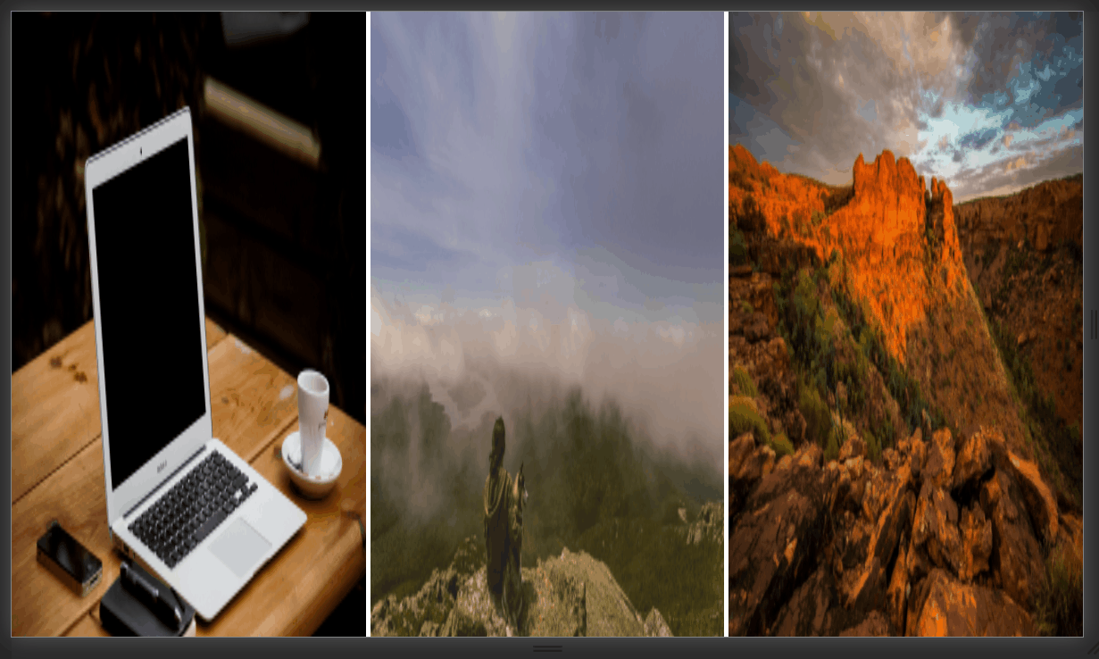
Unfortunately, every image has the same height. To battle this, you want to generate a random height for each image in the gallery. To do this, you may want to use a pre-processor, such as Sass.
Setting up Sass
To super quickly set up Sass, you want to:
npm init -y && npm i sass
then create a parse.js in your root folder that transpiles the scss file:
const fs   = require('fs');
const sass = require('sass');

const res  = sass.renderSync({file: 'css/column.scss'});

fs.writeFileSync('css/column.css', res.css);

console.log('✅ CSS file created at css/column.css');Now you can run node parse.js in your project to generate a valid CSS.
Generating random heights
To generate a random height for each image, you want to use a @for loop:
@for $i from 1 through 30 {
    .gallery-image:nth-child(#{$i}) {
        height: (random(300) + 150) + px;
    }
}This will create 30 different selectors with random heights, using interpolation for the selectors, and the random function for generating random heights. This example will force images to be between 300px and 150px:


 Remove ads
Masonry With Grid
Let’s also see a solution using CSS grid. For this to work, you want to have a perfectly square grid, where each element have the same height and width. To do that, add the following rules to your .gallery, after the resets:
.gallery {
display: grid;
grid-template-columns: repeat(5, 1fr);
grid-gap: 5px;
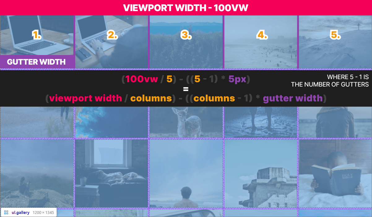
grid-auto-rows: calc((100vw / 5) - ((5 - 1) * 5px));
}It has three grid specific properties:
grid-template-columns: This defines the number of columns. Therepeatfunction takes in a number and a unit to repeat. In this case,1fr. It is short for “fraction” and represents a fraction of the available space in the grid. This is equivalent to writing out1fr5 times.grid-gap: It sets the gap between the elements.grid-auto-rows: This specifies the height of the rows. Since the width of the columns can vary based on the viewport and the number of columns, we need to use a calculation for this.
Luckily, CSS has a built-in calc function that we can use. It first takes in the full width of the viewport (100vw), and divides it by the number of columns. This gives us the with of one column with the gutter. However, we need the width without the gutter. We will always have 1 less gutter than columns (5 - 1). Then we need to multiply that amount by the width of the gutter (5px).
Defining different heights
To make the heights more random, we can use the nth-child selector again, to select certain elements and increase their height:
.gallery-image:nth-child(2n) {
    grid-row: span 2;
}This will double the height of every 2nd element in the grid, making it look like the following:

To make things even more random, you can divide each individual item into smaller sections and make certain children take-up only 1/3 or 1/2 of the available height.
Which One is Better?
While grid is easier to implement, columns have a wider support. Columns are also more flexible, and the output looks closer to a JavaScript implementation. However, you need to know the number of elements inside the grid to generate only the required amount of rules.
The preprocessor also makes sure, that every time your CSS files are re-generated, the height of the images will be different. If this is a concern for you, you can generate the heights once, and then save them to a sass list, and use that for the loop.
If you would like to tweak around with both in one go, I have the project hosted on GitHub. You can clone it from the link below:
The Future of CSS Masonry
Are there any other ways I can create a masonry layout? — As of writing this article, there is an experimental specification for Firefox only, that aims to bring native masonry to CSS grid, by setting grid-template-rows:
.masonry {
    grid-temlate-rows: masonry;
}You can read the documentation on MDN web docs on the link above, to see how you can enable the flag on Firefox to play with this feature.
Apart from CSS, there’s also the original JavaScript version, that can be used for perfect masonry layouts. If you are worried about performance, there’s also a lightweight alternative to Masonry.js, called Colcade.
Do you know other CSS ways that can be used to create a masonry layout? Let us know in the comments below! Thank you for reading through, happy styling!


Rocket Launch Your Career
Speed up your learning progress with our mentorship program. Join as a mentee to unlock the full potential of Webtips and get a personalized learning experience by experts to master the following frontend technologies:
Courses

CSS - The Complete Guide (including Flexbox, Grid and Sass)

The HTML & CSS Bootcamp

The Creative HTML5 & CSS3 Course
Recommended

How to Make Colorful Fireworks in Vanilla JavaScript
2022 06 July • 20 min read
How to Make Interactive Bubble Charts in D3.js
2024 16 January • 11 min read
How to Render React on the Server-Side With Next.js
2021 11 November • 10 min read