How to Make Pixel Art With Box Shadows
 2021 11 November •
  13 min read
Pixel art, one of the earliest forms of digital art, where images are created down at the pixel level. Nowadays, it’s not something you can see on a daily basis unless you are into classic video games or pixel art itself.
In this tutorial, we will bring back pixel art to life and we will try to push the limits of CSS to use it to recreate Mario from the famous Super Mario Bros. game. On top of that, we are only going to use a single HTML element for that.
Pixel Art and Box Shadows
As you could already guess from the title, we are going to achieve this using nothing more but CSS box-shadows. So how come the box-shadow property can generate pixel arts?
This is because, without a spread and blur value, you can replicate the shape of the original element in every possible direction. The box-shadow property also has the advantage, that you can create as many shadows as you want by comma separating them.
Drawing a pixel with box shadow
.box-shadow {
background: beige;
width: 10px;
height: 10px;
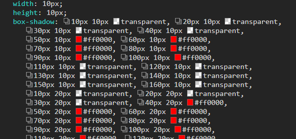
box-shadow: 10px 0 red, 0 10px green;
}The above rule will create a 10×10 rectangle with one red rectangle next to it, and one below it:
We can make box-shadows as complicated as we want them to be, and even create pixel arts. And all you have to have is a single HTML element and a long list of box-shadow rules. However, it would be insane to calculate and write them out manually. For example, to recreate Mario standing from a 16x16px image, you would need 256 different box-shadow rules, exactly this much:
Generating Pixel Arts with Sass
To make things more manageable, we will use the help of Sass. For this project, all you will need is a single HTML element, let it be mario:
<div id="mario"></div>And a Sass file that you can transpile down to CSS. For the sake of simplicity, I’m using this small script after I’ve installed Sass locally:
const fs   = require('fs');
const sass = require('sass');

const res  = sass.renderSync({file: 'pixels.scss'});

fs.writeFileSync('pixels.css', res.css);

console.log('✅ CSS file created');Inside the Sass file, we want to use a mixin like the one below to generate a pixel art based on some parameters:
#mario {
    position: absolute;
    top: 50%;
    left: 50%;
    @include pixel-art($pixelSize, $pixelMap, $colorMap);
}So what are the values of the variables? The $pixelSize simply defines the size of each pixel, while $pixelMap and $colorMap are used for looking up where and which color to use for each box-shadow:
$pixelSize: 10px;
$pixelMap: (
    (0 0 0 0 1 1 1 1 1 1 0 0 0 0 0 0)
    (0 0 0 1 1 1 1 1 1 1 1 1 1 0 0 0)
    (0 0 0 2 2 2 3 3 2 3 3 0 0 0 0 0)
    (0 0 2 3 2 3 3 3 2 3 3 3 3 0 0 0)
    (0 0 2 3 2 2 3 3 3 2 3 3 3 3 0 0)
    (0 0 2 2 3 3 3 3 2 2 2 2 2 0 0 0)
    (0 0 0 0 3 3 3 3 3 3 3 3 0 0 0 0)
    (0 0 0 2 2 1 2 2 2 2 2 0 0 0 0 0)
    (0 0 2 2 2 1 2 2 1 2 2 2 0 0 0 0)
    (0 2 2 2 2 1 1 1 1 2 2 2 2 0 0 0)
    (0 3 3 2 1 3 1 1 3 1 2 3 3 0 0 0)
    (0 3 3 3 1 1 1 1 1 1 3 3 3 0 0 0)
    (0 3 3 1 1 1 1 1 1 1 1 3 3 0 0 0)
    (0 0 0 1 1 1 1 0 1 1 1 1 0 0 0 0)
    (0 0 2 2 2 2 0 0 0 2 2 2 2 0 0 0)
    (0 2 2 2 2 2 0 0 0 2 2 2 2 2 0 0)
);
$colorMap: (
    0: transparent,
    1: #FF0000,
    2: #AC7C00,
    3: #FFA440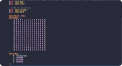
);What you see here, is a matrix, containing 16 lists, each containing 16 values. Each number corresponds to a color, that is defined in a map below the matrix. 0 stands for a transparent color, 1 is for red, and so on. If you look at the matrix from a distance, you can already see Mario taking shape:
We want to loop through this matrix and generate the appropriate box-shadow values for every pixel. Let’s start with the very basics, the shape of the mixin:
@mixin pixel-art($size, $map, $colors) {
    $shadow: null;

    display: block;
    width: $size;
    height: $size;
    box-shadow: $shadow;
}This is what the mixin will generate in the very end. We’re going to populate the $shadow variable with the necessary values. For this to happen, we want to loop through each value, which means, we need two nested loops, one for each list, and one for each value inside the list:
$i: 1;
$j: 1;

@each $list in $map {
    @each $pixel in $list {

        $i: $i + 1;
    }

    $i: 1;
    $j: $j + 1;
}Unfortunately, @each, nor @for has the ability to get an index number from the loop, so we have to create and increment them manually. Make sure you reset $i after each $list. Inside the inner loop, we then want to generate a box-shadow for each value inside the matrix. We need two things:
- The
xandycoordinates of eachbox-shadow - The color associated with it
Based on the size of the pixel and the index of each value inside the matrix, we can calculate where to put the box-shadow, by simply multiplying the size with one of our counters. For the color, we can use map.get to get the appropriate value from $colorMap based on the value inside the matrix:
@use 'sass:map';

$x: $i * $size;
$y: $j * $size;
$color: map.get($colors, $pixel);Don’t forget you need to include the Sass module at the top of your file. Previously, these functions were globally available, they still are to this day, but their use is discouraged as eventually, they will be phased out. We can then add these values together and add it to the $shadow variable:
$shadow: $shadow + #{' '}              // Original value + empty whitespace
                 + $x + #{' '} + $y    // New x,y coordinates
+ #{' '} + $color; // Plus the colorNote that we are using interpolation. If you were to simply append white spaces to the values, you would get a string back, which would make the box-shadow rule invalid. In any case, you could still use string.unquote to convert the string back to a valid box-shadow value.
This implementation so far, however, will not work. This is because we need to comma separate each value. But to do that, we have to wrap the logic into an @if statement:
@if not ($i == list.length($list) and $j == list.length($map)) {
    $shadow: $shadow + #{','};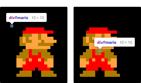
}This will make sure we only separate the rules by commas if we are not at the very last element. Otherwise, we would get a comma at the end of the box-shadow value, which again, invalidates the rule. If you did everything right, you should get the following pixel art in your document:
However, since the whole box-shadow is calculated from the top-left corner, we may not get the correct position we are looking for. Let’s make the anchor point to be centered instead. For this to work, we can define two additional variables inside the mixin:
@use 'sass:list';

$translateX: 0;
$translateY: -(list.length($map) * $size) / 2;One for the x, and one for the y position. The y position can be calculated right away. We need to get the length of the matrix times the size of pixels and divide it by two. Inside the inner @each loop, we can also calculate the x position using the same logic, but using the length of one of the lists this time:
@if ($translateX == 0) {
    $translateX: -(list.length($list) * $size) / 2;
}

...

transform: translate($translateX, $translateY);Then all you have to do, is pass these values into a translate function, and now your pixels are centered. But let’s not stop here, we can also switch between different box-shadows that would create an animation right? Right!

 Remove ads
Animating Pixel Arts
For this, let’s create a separate mixin called animate-pixel-art:
@include animate-pixel-art($pixelSize, $frames, $colorMap, $fps);Unlike the previous mixin, this can take in a frames map and an FPS value. Let FPS be 5, and $frames be a map that contains a matrix for each frame:
$frames: (
    0: ( ...first frame ),
    1: ( ...second frame ),
    2: ( ...third frame ),
);This means we need to change a couple of things around for the mixin. First of all, we will need a map inside the mixin where we can store the generated box-shadow value for each frame:
@use 'sass:string';

@mixin animate-pixel-art($size, $frames, $colors, $fps) {
    $shadows: ();
    $shadow: null;
    $i: 1;
    $j: 1;
    $translateX: 0;
    $translateY: 0;

    $frameIndex: 0;
    $numberOfFrames: list.length($frames);
    $stepAmount: (100 / $numberOfFrames) * 1%;
    $animation-name: string.unique-id();
}We also need a couple of more variables that are related to the animation. The current frame index, the total number of frames, which we can get simply by getting the length of the $frames map, as well as the percentage amount between the steps and a unique animation name.
Let’s say that we have three frames. This means we want to divide 100% by 3 which results in 33%. We should change the box-shadow every 33%, meaning we should get an animation like the one below:
@keyframes animation {
    33% { box-shadow: "containing information from first frame"; }
    67% { box-shadow: "containing information from second frame"; }
    100% { box-shadow: "containing information from last frame"; }
}Since we have one more depth to our data, we also need one more loop, making the mixin use three different @each rules:
@each $index, $frame in $frames {
    $frame: map.get($frames, $index);

    @each $list in $frame {
        @each $pixel in $list {
            ...

            @if ($translateX == 0 and $translateY == 0) {
                $translateX: -(list.length($list) * $size) / 2;
                $translateY: -(list.length($frame) * $size) / 2;
             }
        }
    }

    $j: 1;
    $shadows: map.set($shadows, $frameIndex, $shadow);
    $shadow: null;
    $frameIndex: $frameIndex + 1;
}The logic can stay the same, the only thing we need to change, is the name of the variables, and the @if rule to also populate the $translateY position alongside with the x. Note that in order to get the proper frame, we need to use map.get in the first loop on $frames and do a loop on the return value.
Lastly, at the end of the three loops, we need to reset $j. (Remember to reset $i in the second loop, this has been omitted from the code example above to keep it short.) Here you can add the newly generated shadow to the $shadows map and reset $shadow back to null. If you @debug the $shadows variable, you will get a map back:
(
    0: "generated box shadow for the first frame",
    1: "generated box shadow for the second frame",
    2: "generated box shadow for the last frame"
)We can use this data in another loop to generate the animation for it, using our unique animation-name:
@use 'sass:math';

@keyframes #{$animation-name} {
    @for $i from 1 through $numberOfFrames {
        #{math.round($stepAmount * $i)} {
            box-shadow: map.get($shadows, $i - 1);
        }
    }
}For each frame, this will get the generated box-shadow and adds it to the animation. The last thing is to also add the animation to the element based on the generated $animaton-name:
display: block;
width: $size;
height: $size;
box-shadow: map.get($shadows, 0);
transform: translate($translateX, $translateY);

animation-name: $animation-name;
animation-duration: 1000 / $fps + #{ms};
animation-iteration-count: infinite;
animation-timing-function: linear;Note that this time, you want to use the first frame as the default box-shadow. And with that, you should get Mario running around:
Summary
And now you know everything about the CSS box-shadow property. If you want to try yourself out in pixel art, there are several online tools out there that you can use, such as pixelartcss.com.
To look into the code in one piece, you can refer to this GitHub repository. If you are also interested in game development, continue your journey with the tutorial below.
Do you already created pixel arts with CSS? Share it with us in the comments below! Thank you for reading through, happy art creating and animating! 🎨


Rocket Launch Your Career
Speed up your learning progress with our mentorship program. Join as a mentee to unlock the full potential of Webtips and get a personalized learning experience by experts to master the following frontend technologies:
Courses

CSS - The Complete Guide (including Flexbox, Grid and Sass)

The HTML & CSS Bootcamp

The Creative HTML5 & CSS3 Course
Recommended

Will Rome Replace Webpack?
2021 12 March • 4 min read![Why +(!![]+!![]+!![]+!![]+[!![]+!![]]) yields 42?](/assets/img/content/2021/02/understanding-type-conversion-in-javascript-1024x602.png)
Why +(!![]+!![]+!![]+!![]+[!![]+!![]]) yields 42?
2021 11 November • 5 min read
10 Accessibility Best Practices
2021 02 August • 7 min read