How to Blend Elements Together in CSS
Ferenc Almasi • 2020 September 28 • 1 min read
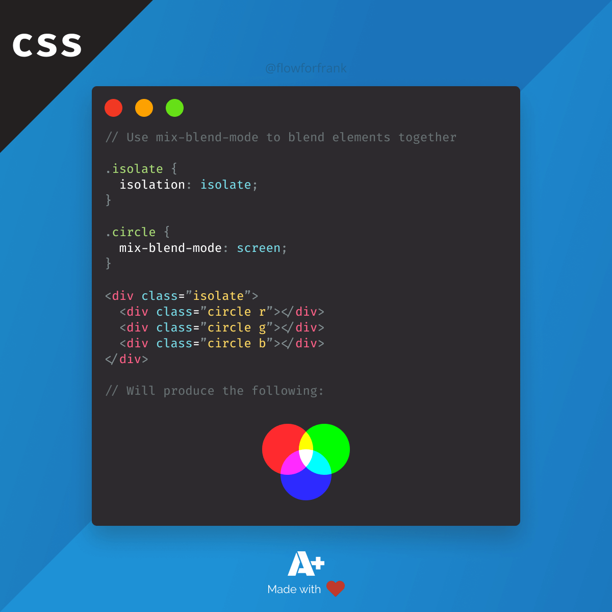
Did you know that you can use pure CSS to blend images together with the mix-blend-mode property in the following way?
Copied to clipboard! Playground
<style>
    .isolate {
        isolation: isolate;
    }

    .circle {
        mix-blend-mode: screen;
    }
</style>

<div class="isolate">
  <div class="circle r"></div>
  <div class="circle g"></div>
  <div class="circle b"></div>
</div>Note, that it's important to set the parent's isolation to isolate if you don't want to blend with the background. The possible values for mix-blend-mode are:
Copied to clipboard! Playground
mix-blend-mode: normal;
mix-blend-mode: multiply;
mix-blend-mode: screen;
mix-blend-mode: overlay;
mix-blend-mode: darken;
mix-blend-mode: lighten;
mix-blend-mode: color-dodge;
mix-blend-mode: color-burn;
mix-blend-mode: hard-light;
mix-blend-mode: soft-light;
mix-blend-mode: difference;
mix-blend-mode: exclusion;
mix-blend-mode: hue;
mix-blend-mode: saturation;
mix-blend-mode: color;
mix-blend-mode: luminosity;
Resources:
📚 More Webtips
Master the Art of Frontend
 Access 100+ interactive lessons
- Unlimited access to hundreds of tutorials
- Prepare for technical interviews
Courses

CSS - The Complete Guide (including Flexbox, Grid and Sass)
Including Flexbox, Grid, and Sass
Whether you're learning CSS for the first time or brushing up on your CSS skills and diving even deeper, this course is for you. Every web developer has to know CSS.

The HTML & CSS Bootcamp
From Zero to Expert!
This course covers flexbox, CSS grid, animations, responsive design, and much more! You will find tons of exercises & projects inside this course.

The Creative HTML5 & CSS3 Course
Build Awesome Websites
Learn HTML5 and CSS3 by creating three amazing, well-designed and animated websites from scratch.