How to Flow Text Around Shapes in CSS
Ferenc Almasi • 2020 01 December • 1 min read
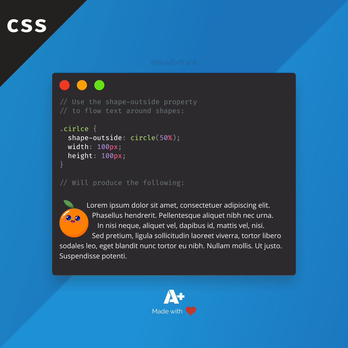
Use the shape-outside property in CSS to flow text around elements. You can also use a polygon for more complex shapes:
In the example above, this will create a circle to wrap around the text. By default, text is wrapped around its margin box. With shape-outside, you can define custom objects to wrap around. To create more complex objects, you can define a polygon or a path:
Copied to clipboard!
.shape-outside {
    shape-outside: polygon(10px 10px, 20px 20px, 30px 30px);
    shape-outside: path('path-rule');
}You can also provide a URL for an image to be used. Make sure it is a png.
Copied to clipboard!
.shape-outside {
    shape-outside: url(circle.png);
}
Resources:
📚 More Webtips

Rocket Launch Your Career
Speed up your learning progress with our mentorship program. Join as a mentee to unlock the full potential of Webtips and get a personalized learning experience by experts to master the following frontend technologies:
Courses

CSS - The Complete Guide (including Flexbox, Grid and Sass)
Including Flexbox, Grid, and Sass
Whether you're learning CSS for the first time or brushing up on your CSS skills and diving even deeper, this course is for you. Every web developer has to know CSS.

The HTML & CSS Bootcamp
From Zero to Expert!
This course covers flexbox, CSS grid, animations, responsive design, and much more! You will find tons of exercises & projects inside this course.

The Creative HTML5 & CSS3 Course
Build Awesome Websites
Learn HTML5 and CSS3 by creating three amazing, well-designed and animated websites from scratch.