How to Use Multiple Text Shadows in CSS
Ferenc Almasi • 2020 November 22 • 1 min read
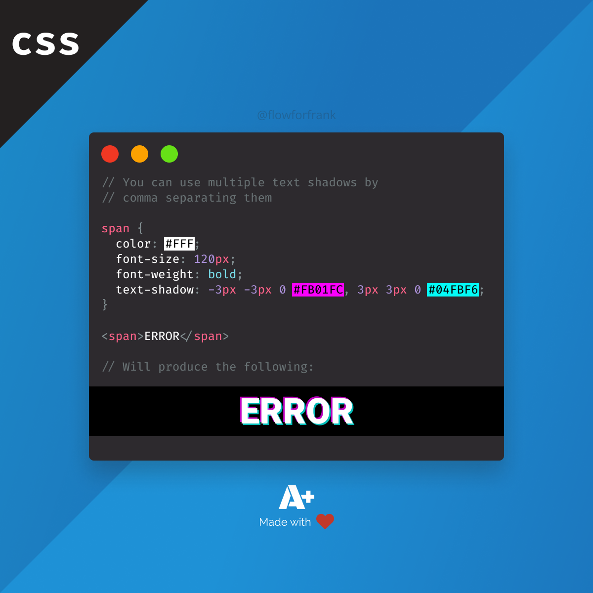
A small CSS trick: you can use multiple text-shadows on a text by comma separating them:
Copied to clipboard! Playground
<!-- You can use multiple text shadows by comma separating them -->
<style>
    span {
        color: #FFF;
        font-size: 120px;
        font-weight: bold;
        text-shadow: -3px -3px 0 #FB01FC, 3px 3px 0 #04FBF6;
    }
</style>

<span>ERROR</span>The example above, will produce the following text:
ERRORIf you were wondering, the different values for text-shadow are as follow:
- value: Represents the X coordinate of the shadow.
- value: Represents the Y coordinate of the shadow.
- value: Sets the amount of blur to be used for the shadow.
- value: Lastly, you can specify the color of the shadow.
Note that you can also use RGBA values for colors to create semi-transparent shadows.

Resources:
📚 More Webtips
Master the Art of Frontend
 Access 100+ interactive lessons
- Unlimited access to hundreds of tutorials
- Prepare for technical interviews
Courses

CSS - The Complete Guide (including Flexbox, Grid and Sass)
Including Flexbox, Grid, and Sass
Whether you're learning CSS for the first time or brushing up on your CSS skills and diving even deeper, this course is for you. Every web developer has to know CSS.

The HTML & CSS Bootcamp
From Zero to Expert!
This course covers flexbox, CSS grid, animations, responsive design, and much more! You will find tons of exercises & projects inside this course.

The Creative HTML5 & CSS3 Course
Build Awesome Websites
Learn HTML5 and CSS3 by creating three amazing, well-designed and animated websites from scratch.