How to Display Different Images Based on Screen Sizes in HTML
Ferenc Almasi • 2020 15 September • 1 min read
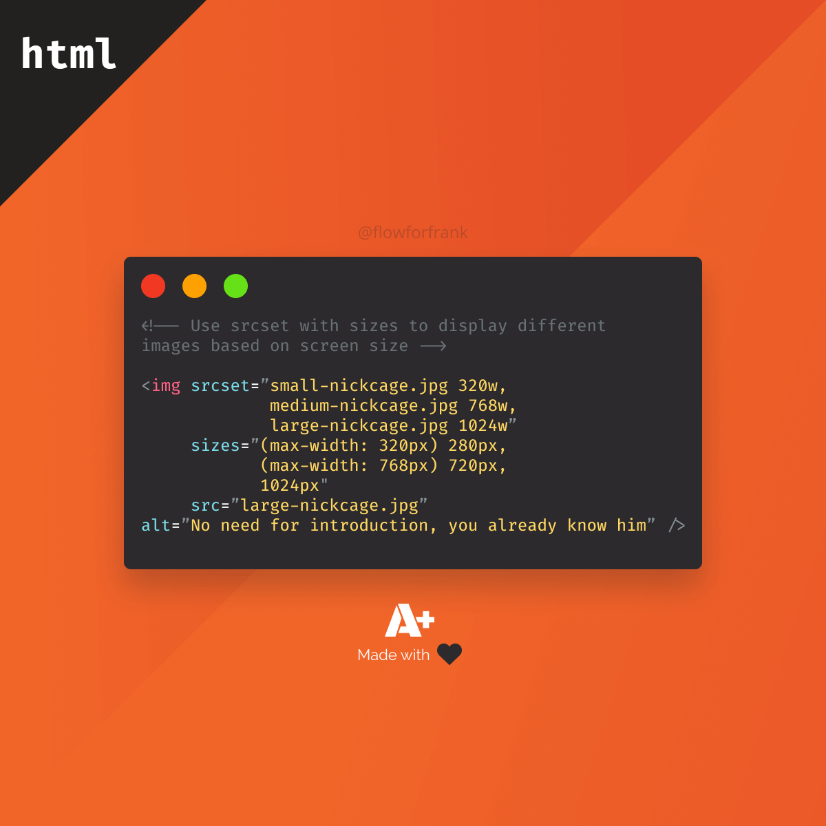
You can create responsive images right inside HTML, by using the srcset and sizes attributes on images:
Copied to clipboard! Playground
<!-- Use srcset with sizes to display different images based on screen size -->

<img srcset="small-nickcage.jpg 320w,
             medium-nickcage.jpg 768w,
             large-nickcage.jpg 1024w"
     sizes="(max-width: 320px) 280px,
            (max-width: 768px) 720px,
            1024px"
     src="large-nickcage.jpg"
alt="No need for introduction, you already know him" />srcset defines a comma-separated list of images with their intrinsic size. On the other hand, sizes holds a list of media queries with preferred image sizes. Meaning that if the browser matches the media query, the image will be displayed on the size specified next to the query.
Resources:
📚 More Webtips

Rocket Launch Your Career
Speed up your learning progress with our mentorship program. Join as a mentee to unlock the full potential of Webtips and get a personalized learning experience by experts to master the following frontend technologies:


 2021 13 July •