How to Manage Multilayered Attribute Filtering in React
 16 min read
In today’s fast-paced digital world, the process of seamlessly filtering and presenting data has become a paramount factor for web applications. Let’s assume you’re building a website, maybe an online store, a content-rich blog, or a data-driven dashboard. What stands between your users and a delightful experience is the ability to sift through vast amounts of information effortlessly.
So, here’s where this concept comes into play. This article dives headfirst into the process of managing multilayered attribute filtering in React. By the end of this article, you won’t just understand multilayered attribute filtering; you’ll wield it like a pro in your React applications, making your user interfaces a joy to explore.
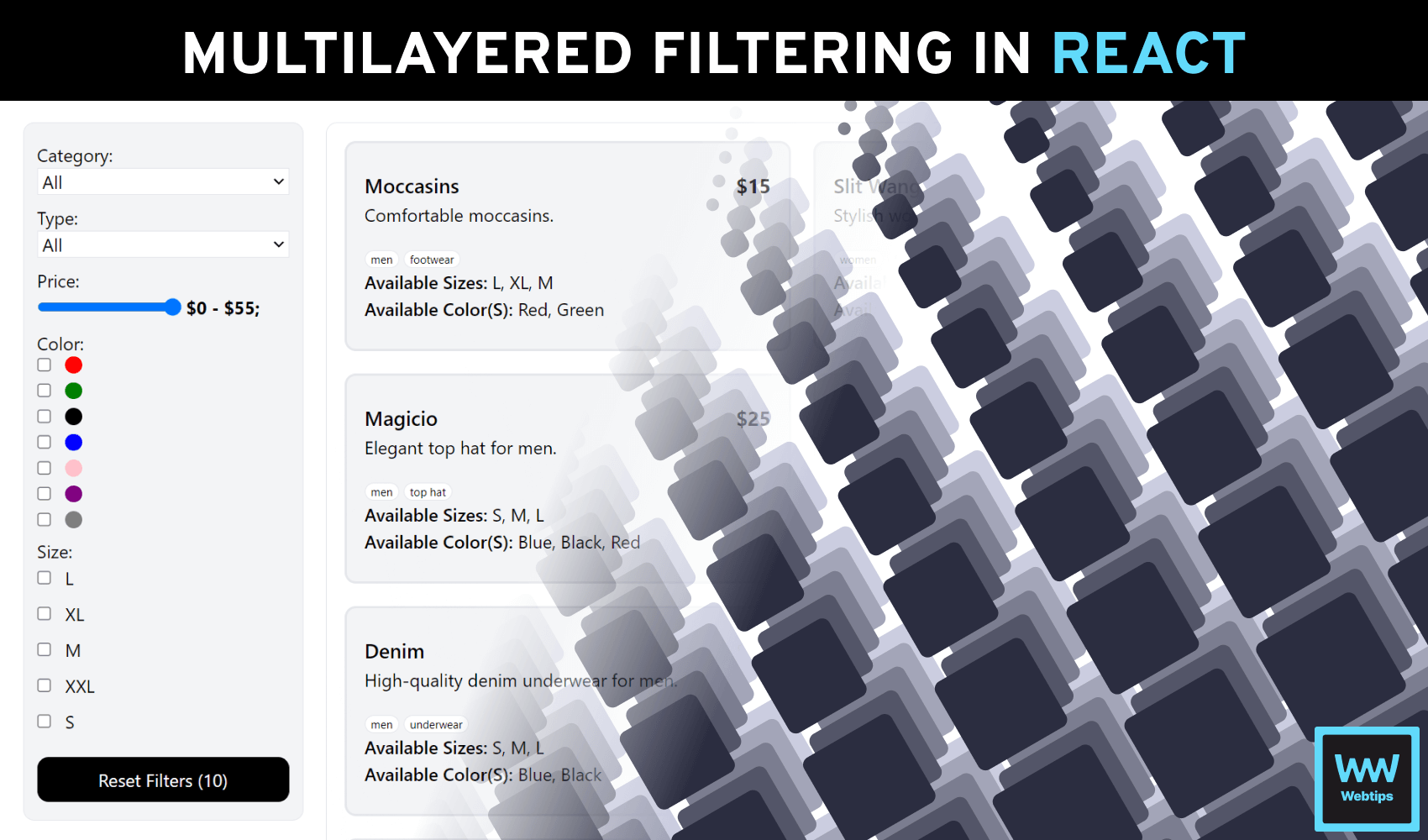
Understanding Multilayered Attribute Filtering
Multilayered attribute filtering is a fundamental concept in web applications. It’s like providing users with a series of filters that narrow down their choices step by step. To illustrate this concept, consider an online fashion shopping site.
Let’s assume you log in to an online fashion store to purchase a shoe. You start with the category “Footwear”, and then choose “Sneakers” as the type. From there, you filter by color, with the select size, and even the brand might be thrown in. Each layer refines your options, helping you find that perfect pair. The Benefits of this includes:
- Precision: Users can find exactly what they want. For instance, they can find “Blue, Size 9” sneakers, avoiding irrelevant results.
- User-Friendly: It creates an intuitive interface, enhancing the user experience, and allowing users to navigate and make selections easily.
- Efficiency: It saves users time, and your app uses resources efficiently by processing only relevant data.
However, challenges one might face with this approach include:
- Complexity: Implementing multiple layers can make your code complex. For example, handling user choices in different layers requires careful planning.
- Performance: Real-time filtering can strain performance with large datasets, making optimizing filtering algorithms crucial.
In the upcoming sections, we’ll guide you through a practical example in React, addressing these challenges and making multilayered attribute filtering a valuable tool in your web app development toolkit.
You can find the complete source code in one piece on GitHub.
Project Setup
For the sake of this article, we’ll be using Vite to start a React application and will be throwing in TypeScript to the mix as well as Tailwind CSS. If you prefer, you can also use CRA. Also, I will be using Yarn as our package manager, but feel free to use NPM if you desire.
- Install React Vite: We Begin by setting up your project using React Vite, a lightning-fast build tool for React applications. Install it globally with npm or yarn if you haven't already:
yarn global add create-vite - Create a New Project: Use React Vite to create a new project with TypeScript support. You can rename multilayer-filter-app with your preferred project name:
create-vite multilayer-filter-app --template react-ts
Alternatively, you can select the features you need when prompted by Vite in the command line when using the following command:
create-vite multilayer-filter-app .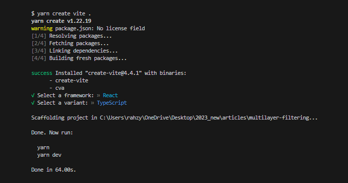

 Remove ads
Creating Data Sources
Since this will be a simple single-page app, we will carry out our operations on the App.tsx file. First, we create a dummy sample products dataset that mimics that of an online fashion store:
interface Product {
    id: string
    category: string
    productType: string
    name: string
    description: string
    color: string[]
    sizes: string[]
    price: number
}

const products: Product[] = [
    {
        id: '5bf14hd7f9cs79s1',
        category: 'men',
        productType: 'footwear',
        name: 'moccasins',
        description: 'Comfortable moccasins.',
        color: ['red', 'green'],
        sizes: ['L', 'XL', 'M'],
        price: 15
    },
    { ... }
]Designing the User Interface
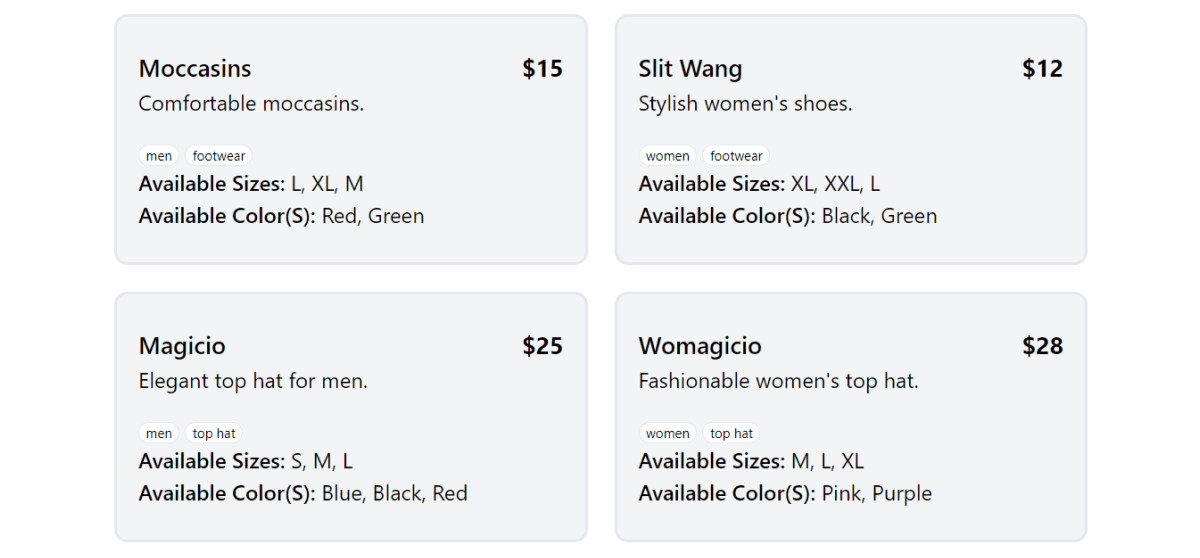
Inside a App.tsx, we structure the HTML markup to present the data mentioned earlier. The styling is accomplished using Tailwind CSS, and our data is rendered using the higher-order map array method starting from line 4 in the code example below:
<aside className="border rounded-[10px] p-4 min-h-[600px] w-full">
  {filteredProducts.length > 0 ? (
    <div className="grid sm:grid-cols-2 grid-cols-1 gap-5">
      {filteredProducts.map((product) => (
        <div
          key={product.id}
          className="px-4 py-6 bg-gray-100 rounded-[10px] border-2"
        >
          <div className="flex items-center justify-between">
            <h2 className="capitalize text-[18px] font-medium">{product?.name}</h2>
            <p className="font-bold text-[18px]">${product?.price}</p>
          </div>

          <p className="pb-5">{product.description}</p>
          <div className="flex space-x-1 text-[10px]">
            <p className="rounded-full px-[5px] border bg-white">{product?.category}</p>
            <p className="rounded-full px-[5px] border bg-white">{product?.productType}</p>
          </div>
          <p><span className="font-semibold">Available Sizes:</span> {product.sizes.join(', ')}</p>
          <p className="capitalize">
            <span className="font-semibold">Available Color(s):</span>
            {product.color.join(', ')}
          </p>
        </div>
      ))}
    </div>) : <div>No Match found</div>
  }
</aside>We'll discuss how to create the filteredProducts variable in the next section. Each property of a product object is referenced inside this map and styled via Tailwind.
Managing State Changes
To make the code more beginner-friendly, we maintain separate variables to track user selections for various filters, such as category, type, price range, colors, and sizes. These variables are initially set to empty values:
// State for each filter layer
const [selectedCategory, setSelectedCategory] = useState<string>('');
const [selectedType, setSelectedType] = useState<string>('');
const [selectedPriceRange, setSelectedPriceRange] = useState<string>('');
const [selectedColors, setSelectedColors] = useState<string[]>([]);
const [selectedSizes, setSelectedSizes] = useState<string[]>([]);

// Filter products based on user selections
const filteredProducts = products
  .filter(product => selectedCategory === '' || product.category === selectedCategory)
  .filter(product => selectedType === '' || product.productType === selectedType)
  .filter(product => selectedPriceRange === '' || product.price <= parseFloat(selectedPriceRange))
  .filter(product => selectedColors.length === 0 || selectedColors.every(color => product.color.includes(color)))
.filter(product => selectedSizes.length === 0 || selectedSizes.every(size => product.sizes.includes(size)));Then, we apply these filters to the list of products to display only the items that match the selected criteria. If a filter is empty (meaning no selection is made), it does not affect the filtering process for that specific attribute. This approach allows us to dynamically refine the product list based on the user’s filter choices.
Building the Filter Components
Inside the components folder of our React application, we create two filter components: one for dynamic filters that handle changes for non-array-related keys and one for array-related keys. These components help us refine our search when looking for products. The first is named DynamicFilter.tsx:
import { useEffect, useState } from 'react'

function DynamicFilter({
    label,
    options,
    selectedOptions,
    setSelectedOptions,
    isPriceRange = false,
    filteredProducts,
    products
}) {
    // Function to calculate the highest price from products
    const getMaxPrice = () => Math.max(...products.map((product) => product.price), 0)
    const getSelectionPrice = () => Math.max(...filteredProducts.map((product) => product.price), 0)

    // State to store the initial max value for the price range slider
    const [maxPrice, setMaxPrice] = useState(getMaxPrice())
    const [selectionPrice, setSelectionPrice] = useState(getSelectionPrice())

    // State to track the current value of the range slider
    const [sliderValue, setSliderValue] = useState(maxPrice.toString())

    useEffect(() => {
        // Here, this updates the max value of the price range slider when products change
        setMaxPrice(getMaxPrice())
        setSelectionPrice(getSelectionPrice())
    }, [filteredProducts, products])

    return (...) // Continued in the next example
}

export default DynamicFilterIn this component, we manage the filter options for a specific attribute, which can be a category, type, price range, or others. The user’s selection for this filter is stored in the selectedOptions state variable. We also handle price range filtering when isPriceRange is set to true. Here's how it works:
- Line 13: We calculate the maximum price from the list of products to determine the price range slider’s upper limit.
- Line 17: We maintain the initial maximum price and the current selected price based on the filtered products.
return (
    <div className='mb-2'>
        <h3>{label}:</h3>
        {isPriceRange ? (
            <div className='flex'>
                <input
                    type="range"
                    min="0"
                    max={maxPrice.toString()}
                    step="1"
                    value={sliderValue as string}
                    onChange={(e) => {
                        const minPrice = e.target.value
                        setSliderValue(minPrice)
                        setSelectedOptions([minPrice, sliderValue)
                    }}
                />
                <div className='whitespace-nowrap font-bold ml-1'>
                    $0 - ${selectionPrice}
                </div>
            </div>
        ) : (
            <select
                value={selectedOptions as string}
                onChange={(e) => setSelectedOptions(e.target.value)}
                className='border w-full rounded-none capitalize'
            >
                <option value="">All</option>
                {options.map((option) => (
                    <option key={option} value={option}>
                        {option}
                    </option>
                ))}
            </select>
        )}
    </div>
)- Line 4: Depending on whether it’s a price range filter or a regular dropdown, we render either a slider or a select input.
- Lines 12-15: When the user interacts with the slider or selects an option from the dropdown, we update the
selectedOptionsstate accordingly.
The component also updates the maximum price when the list of products or the filtered products changes. This ensures that the price range slider always reflects the correct price range available in the products.
Overall, this component enables users to filter products based on their preferences for a specific attribute, making the shopping experience more interactive and personalized. The second component is named CheckFilter.tsx:
function CheckboxFilter({ label, options, selectedOptions, setSelectedOptions, isColor }) {
  const handleCheckboxChange = (option: string) => {
    if (selectedOptions.includes(option)) {
        setSelectedOptions(selectedOptions.filter((item) => item !== option))
    } else {
        setSelectedOptions([...selectedOptions, option])
    }
  }

  return (
    <div className="bg-gray-100 mb-2">
      <h3>{label}:</h3>
      <div className="space-y-2">
        {options.map((option) => (
          <label className="flex space-x-3" key={option}>
            <input
              type="checkbox"
              value={option}
              checked={selectedOptions.includes(option)}
              onChange={() => handleCheckboxChange(option)}
            />
           {isColor
              ? <div className="h-[15px] w-[15px] rounded-full" style={{ backgroundColor: option }} />
              : option
           }
          </label>
        ))}
      </div>
    </div>
  )
}

export default CheckboxFilterThis component is designed to handle checkboxes for filtering options in our application. It can be used for various filtering purposes, such as colors or sizes. Here are the props it accepts, and what they do:
label: Displays a label to describe what we’re filtering, like “Color” or “Size.”options: These are the available filtering choices. For example, if we’re filtering by colors, the options could be different colors like red, blue, or green.selectedOptions: This prop keeps track of which filtering options have been selected by the user.setSelectedOptions: This is a function that allows us to update the selected filtering options when a user interacts with the checkboxes.isColor: A flag that tells the component whether the filtering options are colors or something else (like sizes). If it’s set totrue, the component will display color swatches next to the checkboxes.
Inside the CheckFilter.tsx component, we loop through the options and create a checkbox for each one. When a user interacts with a checkbox (checks or unchecks it), the handleCheckboxChange function is called. It updates the selectedOptions based on the user’s actions.
Remove adsUsing the Filter Components
After these components have been created, they can be imported to App.tsx to perform their designated function. Also, a function called resetFilters can be created to help clear user selections and return to the default state:
// Collect unique properties from products
const categories = [...new Set(products?.map((val: Product) => val.category))]
const productTypes = [...new Set(products?.map((val: Product) => val.productType))]
const colors = [...new Set(products?.flatMap((val: Product) => val.color))]
const sizes = [...new Set(products?.flatMap((val: Product) => val.sizes))]

// Reset all filters with one click
const resetFilters = () => {
    setSelectedCategory('')
    setSelectedType('')
    setSelectedPriceRange('')
    setSelectedColors([])
    setSelectedSizes([])
}

// Inside the return, we call the component with the options
<DynamicFilter
  label="Category"
  options={categories}
  selectedOptions={selectedCategory}
  setSelectedOptions={setSelectedCategory}
/>
<DynamicFilter
  label="Type"
  options={productTypes}
  selectedOptions={selectedType}
  setSelectedOptions={setSelectedType}
/>
<DynamicFilter
  label="Price"
  isPriceRange={true}
  selectedOptions={selectedPriceRange}
  setSelectedOptions={setSelectedPriceRange}
  filteredProducts={filteredProducts}
  products={products}
/>
<CheckboxFilter
  label="Color"
  options={colors}
  selectedOptions={selectedColors}
  setSelectedOptions={setSelectedColors}
  isColor={true}
/>
<CheckboxFilter
  label="Size"
  options={sizes}
  selectedOptions={selectedSizes}
  setSelectedOptions={setSelectedSizes}
  isColor={false}
/>

<button onClick={resetFilters}>Reset Filters ({filteredProducts?.length})</button>Once we’ve imported these components and provided the necessary information through their props, users can effortlessly refine their search.
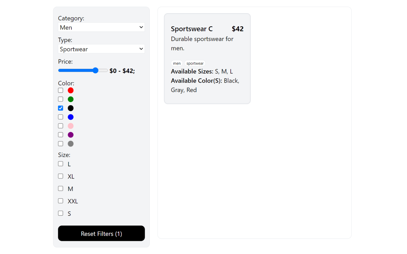
Just like a user named Mr. FooBar who is looking to buy a medium-sized, black men’s sportswear priced at $42 or less. With these components in place, Mr. FooBar can simply select the desired options to find the perfect product that matches his criteria.
This user-friendly interface allows for precise and efficient searching, making the shopping experience smoother and more tailored to individual preferences.
Best Practices
Here are some best practices we can draw from this:
- Component Reusability: These components can be used across different parts of the application to maintain consistency and reduce code duplication.
- Prop Types: Encourage the use of prop types to define and document the expected props for your filter components. This helps prevent runtime errors and makes it easier for developers to work with these components.
- State Management: Help developers understand how changes in state trigger re-renders and affect the displayed results through self-documenting code.
Conclusion
In conclusion, mastering the art of multi-layer filtering in React opens up a world of possibilities for creating powerful, user-friendly applications. With clean code, thoughtful design, and attention to best practices, you can provide your users with a seamless experience.
To see these concepts in action, check out the live demonstration of multilayer filtering hosted on Vercel. For a deeper dive into the code and resources to enhance your filtering skills, visit the GitHub repository.
Remember, the ability to refine and customize data presentation is a valuable skill in web development, and with the right tools and knowledge, you can craft dynamic and responsive filter components that empower users. Happy coding!
 Access 100+ interactive lessons
- Unlimited access to hundreds of tutorials
- Prepare for technical interviews
Courses


Recommended

How to Create Draggable HTML Elements With JavaScript
5 min read
How to Create an Editable Table Component in React
13 min read
CSS Grid vs Flexbox - Which One to Use and Why?
8 min read