How to Blur Background Behind Elements in CSS
Ferenc Almasi • 2020 30 November • 1 min read
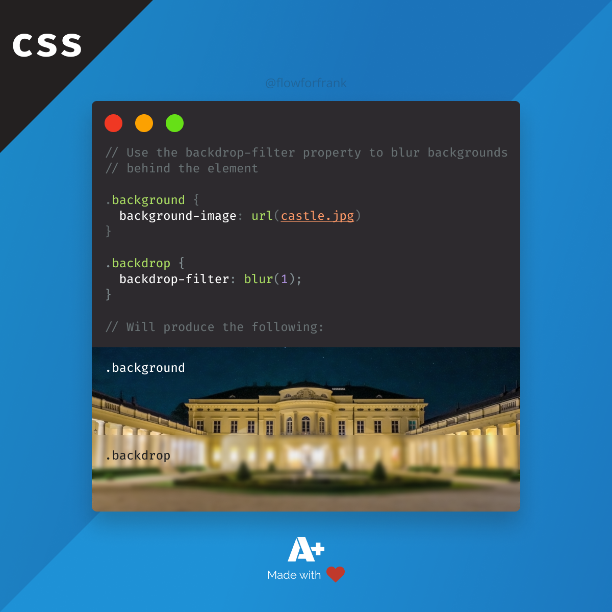
You can use the backdrop-filter property in CSS to blur the background image behind an element with a transparent background:
Copied to clipboard! Playground
.background {
    background-image: url(castle.jpg)
}

.backdrop {
    backdrop-filter: blur(1);
}It applies to everything behind the element where the backdrop-filter is defined, therefore make sure you make the element at least partially transparent in order to see the result. This property is often used to blur out the background behind a popup.
Also, this not only works with blur, but with other filter functions as well.
Copied to clipboard! Playground
.backdrop {
    backdrop-filter: brightness(50%);
    backdrop-filter: contrast(50%);
    backdrop-filter: drop-shadow(0 0 5px #000);
    backdrop-filter: grayscale(100%);
    backdrop-filter: hue-rotate(90deg);
    backdrop-filter: invert(100%);
    backdrop-filter: opacity(50%);
    backdrop-filter: sepia(100%);
    backdrop-filter: saturate(100%);
}
Resources:
📚 More Webtips

Rocket Launch Your Career
Speed up your learning progress with our mentorship program. Join as a mentee to unlock the full potential of Webtips and get a personalized learning experience by experts to master the following frontend technologies:
Courses

CSS - The Complete Guide (including Flexbox, Grid and Sass)
Including Flexbox, Grid, and Sass
Whether you're learning CSS for the first time or brushing up on your CSS skills and diving even deeper, this course is for you. Every web developer has to know CSS.

The HTML & CSS Bootcamp
From Zero to Expert!
This course covers flexbox, CSS grid, animations, responsive design, and much more! You will find tons of exercises & projects inside this course.

The Creative HTML5 & CSS3 Course
Build Awesome Websites
Learn HTML5 and CSS3 by creating three amazing, well-designed and animated websites from scratch.
Recommended
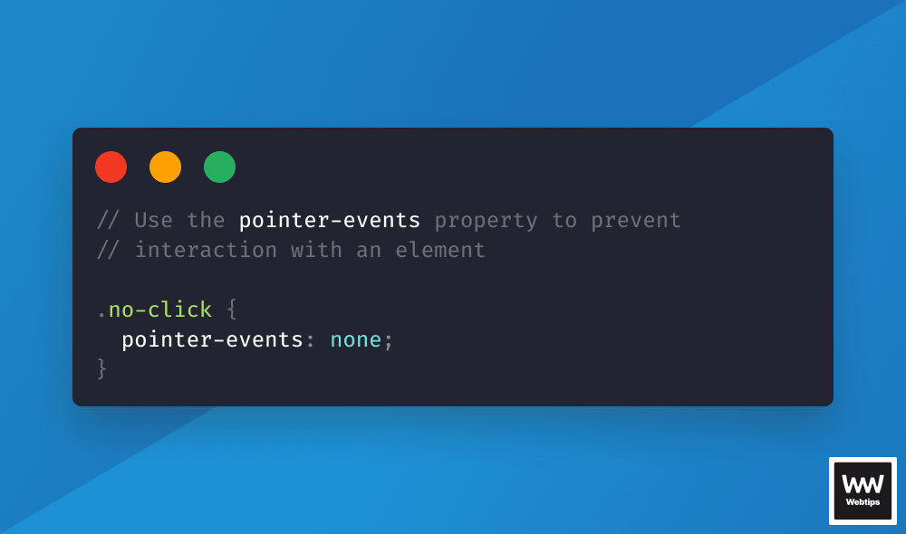
How to Prevent Elements Receiving Click Events With CSS
And other solutions
Ferenc Almasi •  2024 20 February • 5 min read
How to Center Text Vertically and Horizontally in CSS
Ferenc Almasi • 2020 30 November • 1 min read
How to Dead Center Absolutely Positioned Elements in CSS
Ferenc Almasi • 2020 23 November • 2 min read