How To Create Equal Height Columns With Flexbox
Ferenc Almasi • 2020 August 10 • 1 min read
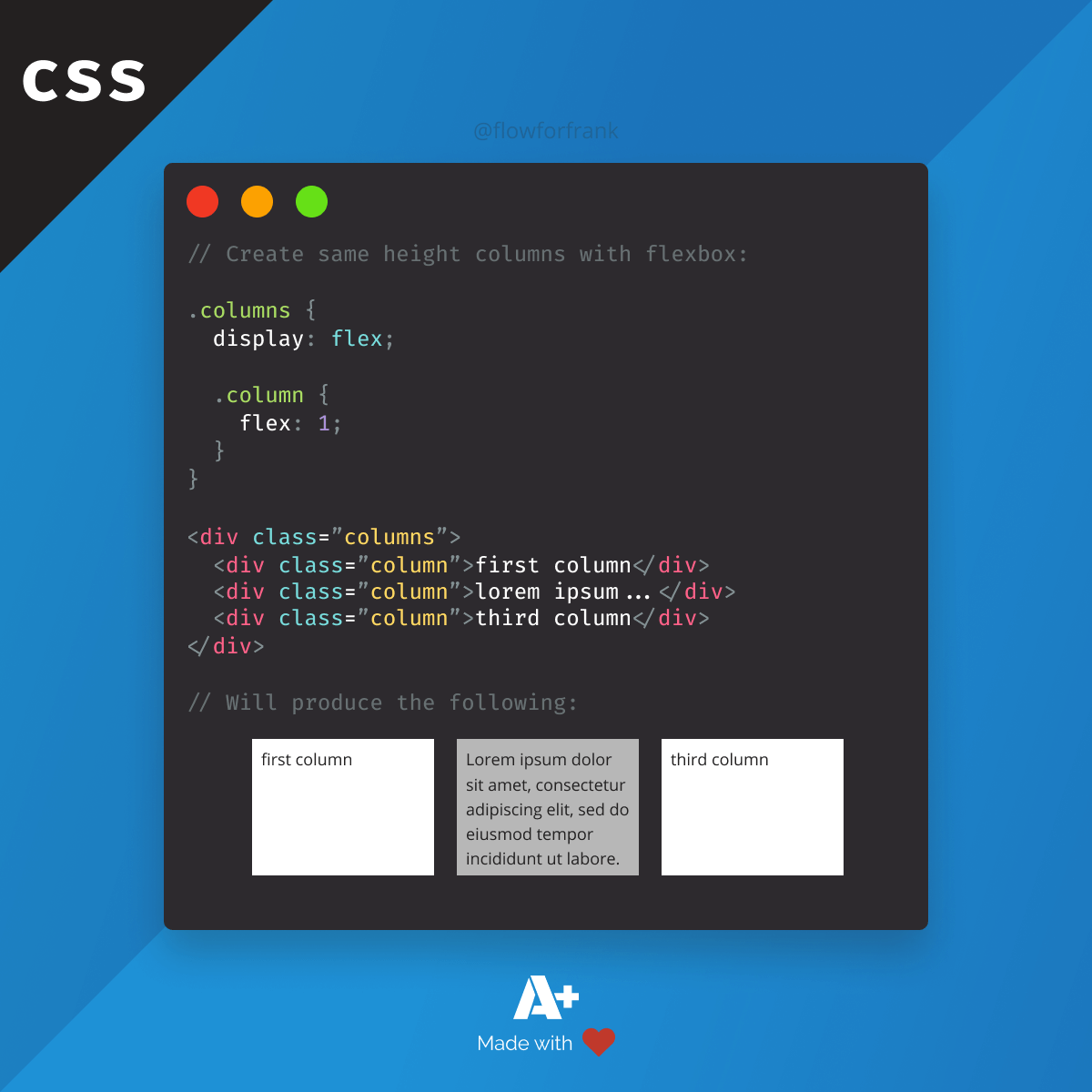
Using flexbox it only takes two rules to create even height columns in CSS, even if your content is different for each of them:
Copied to clipboard!
.columns {
    display: flex;

    .column {
        flex: 1;
    }
}There are also other ways to achieve the same effect. For example, by using grid, again, you need two rules:
Copied to clipboard!
.columns {
    display: grid;
    grid-auto-flow: column;
}And the same can be done using tables as well:
Copied to clipboard!
.columns {
    display: table;

    .column {
        display: table-cell;
    }
}
Resource
📚 More Webtips
Master the Art of Frontend
 Access 100+ interactive lessons
- Unlimited access to hundreds of tutorials
- Prepare for technical interviews
Courses

CSS - The Complete Guide (including Flexbox, Grid and Sass)
Including Flexbox, Grid, and Sass
Whether you're learning CSS for the first time or brushing up on your CSS skills and diving even deeper, this course is for you. Every web developer has to know CSS.

The HTML & CSS Bootcamp
From Zero to Expert!
This course covers flexbox, CSS grid, animations, responsive design, and much more! You will find tons of exercises & projects inside this course.

The Creative HTML5 & CSS3 Course
Build Awesome Websites
Learn HTML5 and CSS3 by creating three amazing, well-designed and animated websites from scratch.
 2021 July 19 •