
The Building Blocks of Astro Components
 6 min read
Astro components are the building blocks of Astro projects. They are templating components that mostly generate static HTML and can be identified by their .astro extension. In this tutorial, we'll take a quick look at how Astro components are structured.
The Structure of Astro Components
Each Astro component can be broken down into two main parts:
---
// Component script goes here
---

<!-- Component template goes here -->- Component script: This is where component-related scripts can be run on the server, such as importing other components, fetching data from an API, or creating variables and reading props. JavaScript written here won't be included in the final bundle.
- Component template: The HTML output for the component. Anything written here will be rendered on the page, including HTML comments.
Note that the component script is wrapped between code fences denoted by ---. It follows the same syntax as frontmatter in Markdown files. Anything written here will only be executed on the server.
On the other hand, the component template will be rendered. Here we can reference other Astro components too. Let's say we have the following call-to-action component:
<a href="/contact">Contact us</a>We can reference this component inside other Astro components by importing it in the component script and then referencing it in the component template part, similar to the way it would be done in React:
---
import Cta from '../components/Cta.astro'
---

<h1>You can contact us using the button below:</h1>
<Cta />This will render an h1 and an anchor on the page. If a component doesn't include any content, it is self-closing. Also, component names must start with an uppercase letter; otherwise, they'll be treated as regular HTML tags.
We can also use style and script tags in Astro components. This is useful if we want to add styles or interactivity to a component. Styles and scripts are automatically scoped to the component and won't be shared with other parts of the code:
<a href="/contact">Contact us</a>

<style>
    /* Styles are scoped */
    a { ... }
</style>

<script>
    console.log('Script only runs if the component is rendered.')
</script>Note that component scripts (---) can be omitted if we don't need any functionality.
How to Use Props
Now that we're familiar with the basic building blocks of an Astro component, let's see how we can use props. Properties (props for short) work very similarly to the way we can create props in React, and they're a core part of Astro components that lets us pass data around and customize behavior. The following example shows how to pass and read props in Astro:
// Inside a Button component:
---
const { text } = Astro.props
---

<button>{text}</button>

// Inside index.astro:
---
import Button from '../components/Button.astro'
---

<Button text="Get in touch" />We can reference props through Astro.props inside a component. A common convention is to use destructuring assignment; however, we could also reference this prop through Astro.props.text. We can pass as many props to a component as necessary. It's also possible to implicitly pass props to an element using the spread operator:
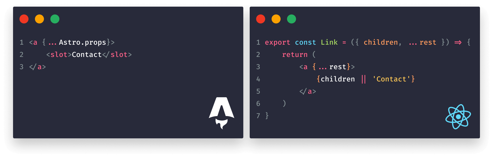
// Inside a Link component:
---
const { text } = Astro.props
---

<a {...Astro.props}>{text}</a>

// Inside index.astro:
<Link text="Get in touch" href="/contact" rel="noreferrer" />This will automatically pass the href and rel attributes to the anchor. However, this has a downside. The anchor will now also have a text attribute because we spread all props on the element. We can luckily fix this easily by changing the code to the following:
---
const {
    text,
    ...rest
} = Astro.props
---

<a {...rest}>{text}</a>This way, we've separated the text prop from the rest of the props, so now it won't be used as an attribute. However, we can take this code one step further and improve it with slots.

 Remove ads
Component Slots
Slots in Astro act in a similar way to children in React. They essentially refer to the same thing: content passed between a component. Let's see how using a slot changes our component:
// Inside a Link component:
<a {...Astro.props}>
    <slot />
</a>

// Inside index.astro:
<Link href="/contact" rel="noreferrer">Contact</Link>Instead of using a prop, now we can pass the text of the anchor between the component tags using the special slot tag. This makes calling the component more intuitive as it now highly resembles an HTML element.
We can also provide fallback content for slots to make them optional. In case there's no content between the component tags, the fallback slot will be rendered, just like in the following example:
<a {...Astro.props}>
    <slot>Contact</slot>
</a>

// When calling the component, we can omit the content to active the fallback:
<Link href="/contact" rel="noreferrer" />We can also use multiple slots by naming them using the name attribute. This is useful if we need to inject children elements into a component in different places:
<body>
    <slot name="left-sidebar" />
    <main>
        <slot />
    </main>
    <slot name="right-sidebar" />
</body>In this example, we have three different slots in our Layout component. Two of them are using a name attribute. The slot without the name will be treated as a default slot. Let's see how we can call them on a page:
---
import Layout from '../components/Layout.astro'
---

<Layout>
    <aside slot="left-sidebar">Left sidebar</aside>
    <article>
        This element will be injected in the default slot
    </article>
    <aside slot="right-sidebar">Left sidebar</aside>
</Layout>To place content into a named slot, we can pass a slot attribute to the element with the value referencing the slot's name. This behavior makes Astro's components extremely flexible for building reusable and customizable layouts.
Summary
In summary, the structure of Astro components is somewhere between React, Svelte, and Markdown. We don't need function declarations or return statements; instead, we can write templates right away.
This approach compared to React components is much simpler, easier to read and maintain, and understand, although we have to point out that React was not meant for static site generation. This is how the same component compares in Astro vs React:
Have you had any experience working with Astro components? Leave your thoughts in the comments below! Thank you for reading!
 Access 100+ interactive lessons
- Unlimited access to hundreds of tutorials
- Prepare for technical interviews
Courses


Recommended

How to Work With CSS in Astro
9 min read
Astro vs JSX — What are the Differences?
12 min read
What is Astro? — Introduction to Static Site Generators
11 min read