How to Create Native Popovers in HTML Without JavaScript
 6 min read
Popular libraries like Bootstrap often come with popovers that act as a way to display additional information to users when interacting with elements. Popovers are now coming to HTML natively.
The new experimental Popover API proposes a way to create popovers in HTML without the use of JavaScript or any third-party libraries. In this tutorial, we will take a look at how to use it. At the end of this tutorial, you will also find interactive buttons that you can use to trigger different types of popovers and see how they look.
Create a Popover in HTML
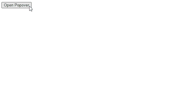
The simplest way to create a popover in HTML using the new Popover API is to define an element as a popover using the new popover attribute and reference the element's id in a popovertarget:
<div popover id="popover">This will be shown on click</div>
<button popovertarget="popover">Open Popover</button>This will create a basic popover that we can toggle with the button. By default, the element will appear in the middle of the page, above everything else.
Popovers are not influenced by parent elements' position or overflow; therefore, they cannot be positioned relative to other elements.
One thing you will notice is that the popover is dismissed automatically if the button or other elements are clicked. While they seemingly behave and look the same way as default modals in HTML, they are not the same.
Use Cases of Popover
When should you use a popover, and when should you use a modal? Generally speaking, when you want to create a modal in HTML, the right way to go is to use a dialog element.
Popovers, on the other hand, are used for other elements, such as custom toast notifications, form element suggestions, or tutorials for the use of an application.
Popovers are used for displaying additional information without interrupting the user's workflow, whereas modals usually require input from the user, such as a confirmation.
Toggle Popover From JavaScript
Popovers can also be toggled through JavaScript dynamically using the Popover API. Let's take the same example, but instead of defining a popovertarget on the button, we just need a selector:
<div popover id="popover">Default popover</div>
<button class="toggle">Toggle popover with JavaScript</button>

<script>
    const button = document.querySelector('.toggle')
    const popover = document.querySelector('[popover]')

    button.addEventListener('click', () => popover.togglePopover())
</script>To toggle the popover, we need to call togglePopover on the popover element (the element with the popover attribute). This will toggle the popover between the showing and hidden states.
We can also use the showPopover and hidePopover methods to show and hide the element whenever necessary.
 Remove ads
Style Popover as Toast Messages
Now that we've covered all aspects of how to toggle popovers in HTML, let's see how we can style them through CSS. One of the most common ways to display a popover is to add a backdrop with a semi-transparent darker background to bring focus to the element.
Luckily, we can target the ::backdrop pseudo-element in CSS to achieve the same effect without using any additional DOM elements:
[popover]::backdrop {
    background: rgb(0 0 0 / 70%);
}The open state can also be styled separately by targeting the open attribute on the popover:
.popover[open] {
    ...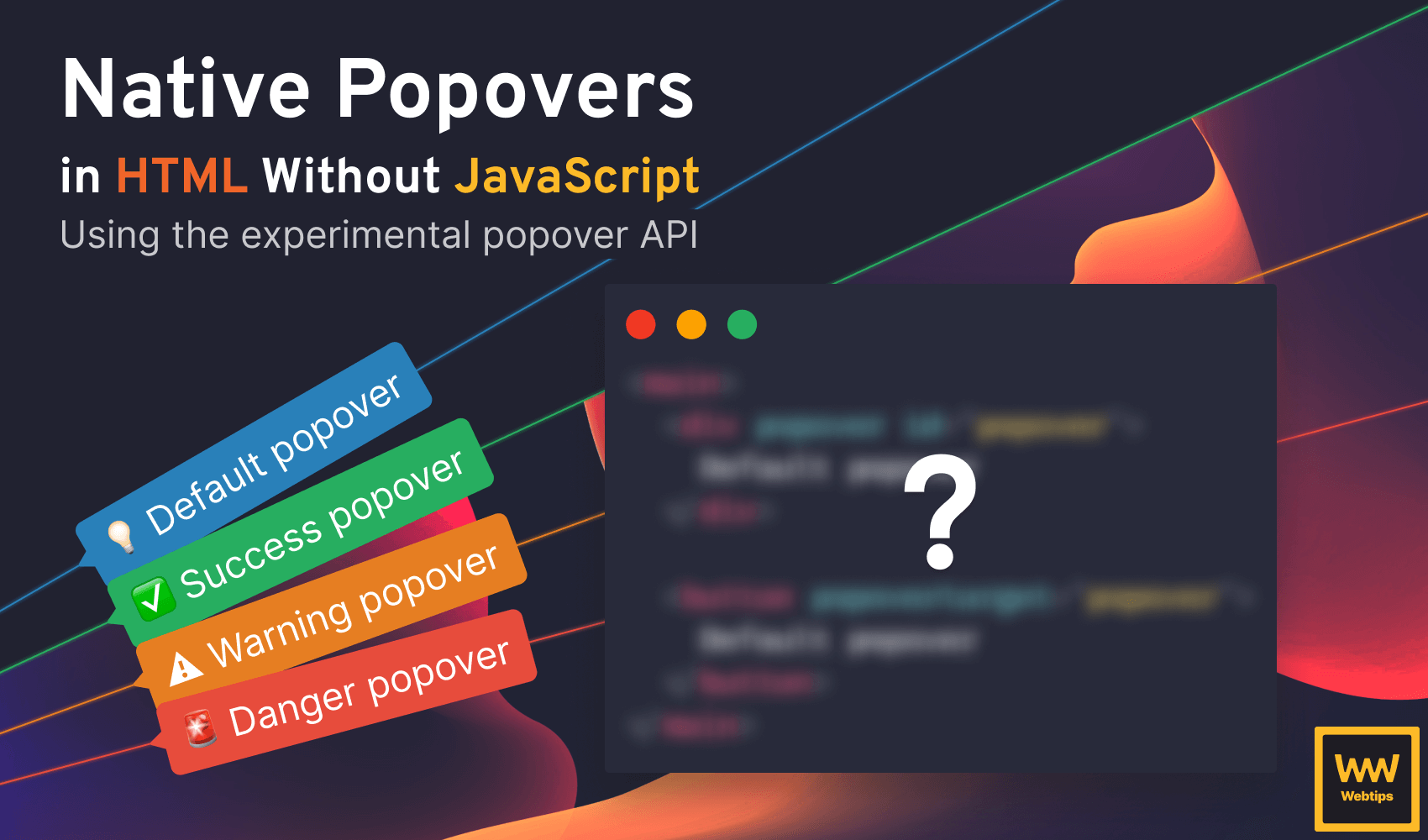
}Now let's take a look at how to create four different toast notifications from popovers using different classes. Create the following four different popovers with four different buttons in HTML:
<div popover id="popover">Default popover</div>
<div popover id="popover-success" class="success">Success popover</div>
<div popover id="popover-warning" class="warning">Warning popover</div>
<div popover id="popover-danger" class="danger">Danger popover</div>

<button popovertarget="popover">Default popover</button>
<button popovertarget="popover-success">Success popover</button>
<button popovertarget="popover-warning">Warning popover</button>
<button popovertarget="popover-danger">Danger popover</button>Here, each button is responsible for triggering one type of popover: a default (info) popover, success, warning messages, and a danger toast for error messages.
Toast messages are usually displayed at the bottom of the screen to avoid being too intrusive but still keep them visible to users. To achieve this with CSS, we can absolutely position the element at the bottom using the following classes:
[popover] {
    position: absolute;
    top: auto;
    bottom: 30px;
    border-radius: 5px;
    padding: 10px 15px;
    border: 0;
    background: #2980B9;
    color: #FFF;
}This will position the popovers 30px from the bottom of the screen. You can also use position: fixed to keep the popover fixed to the bottom of the screen during scrolling. Here, we can also add some general style to all popovers by targeting the popover attribute using the [popover] selector.
To add different background colors, we can target the classes on the popovers. Extend the CSS with the following to introduce the styles for the other states:
[popover].success { background: #27AE60; }
[popover].warning { background: #e67e22; }
[popover].danger { background: #E74C3C; }This way, the default background color will be overwritten every time we use one of the classes on one of the popovers. We can also introduce an icon in front of the text to better convey the meaning of messages. This can be done purely in CSS with the help of the ::before pseudo-element selector:
[popover]::before { content: '💡 '; }
[popover].success::before { content: '✅ '; }
[popover].warning::before { content: '⚠️ '; }
[popover].danger::before { content: '🚨 '; }Now we have fully working toast messages written entirely in HTML and CSS. In case you also need to attach a backdrop, you can use the ::backdrop pseudo-element selector on the popover as shown before.
You can also add backdrop-filter: blur(2px); to also blur elements behind the backdrop.
You can play around with the buttons below to see how these toast messages will look on a live site. Note that the examples may only work in the latest versions of Chrome and Edge as of the writing of this tutorial due to a lack of support.
Summary
In summary, the new Popover API in HTML provides an easy way to introduce different types of popovers without writing a single line of JavaScript. As this is still an experimental API, don't use it in production. Support is still relatively low, but it will gain more adoption as the feature exits the experimental stage.
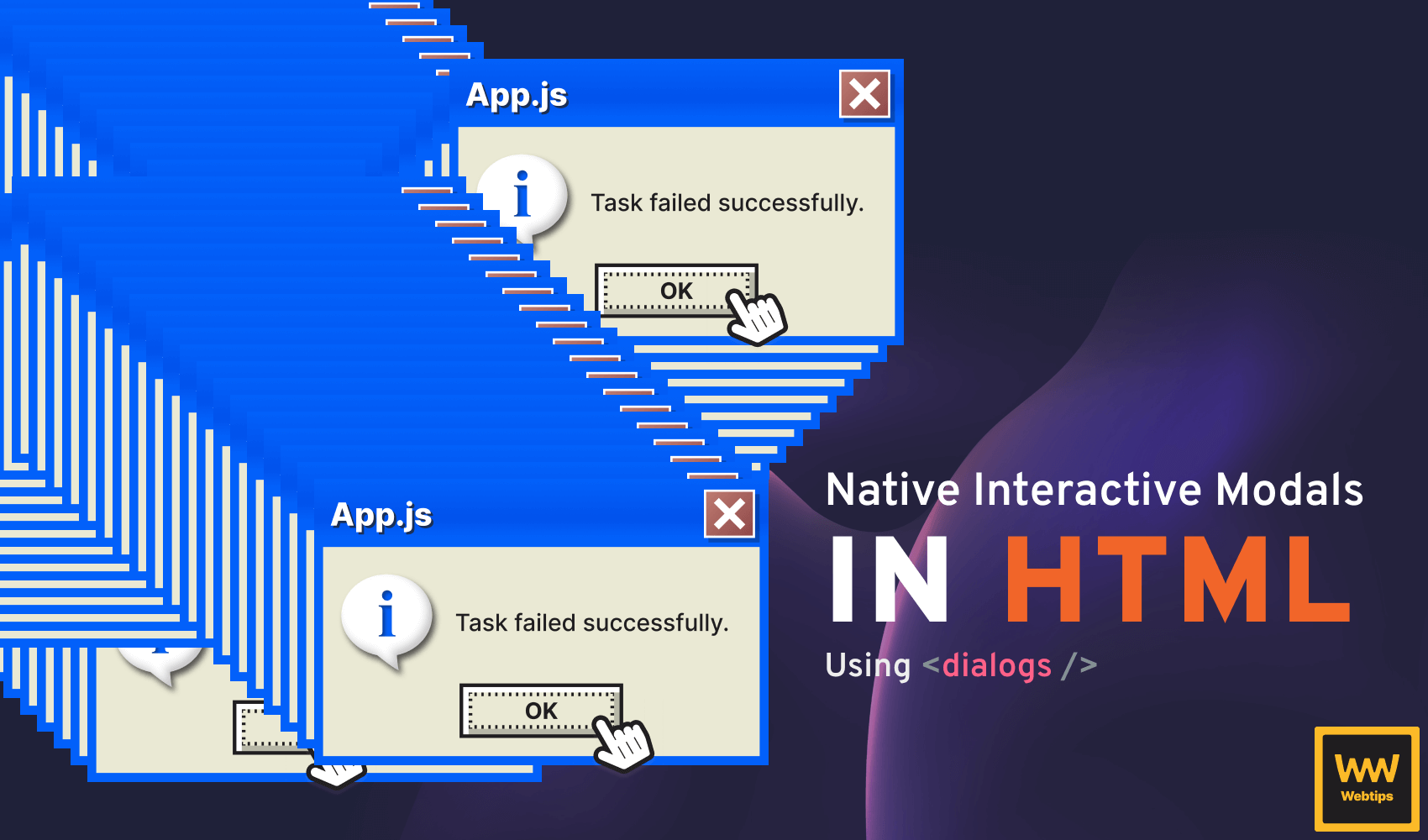
If you are interested in learning more about HTML and CSS, make sure you check out the following tutorial where we take a look at how to create the closest thing to popovers in HTML natively: interactive modals.
 Access 100+ interactive lessons
- Unlimited access to hundreds of tutorials
- Prepare for technical interviews
Courses


Recommended
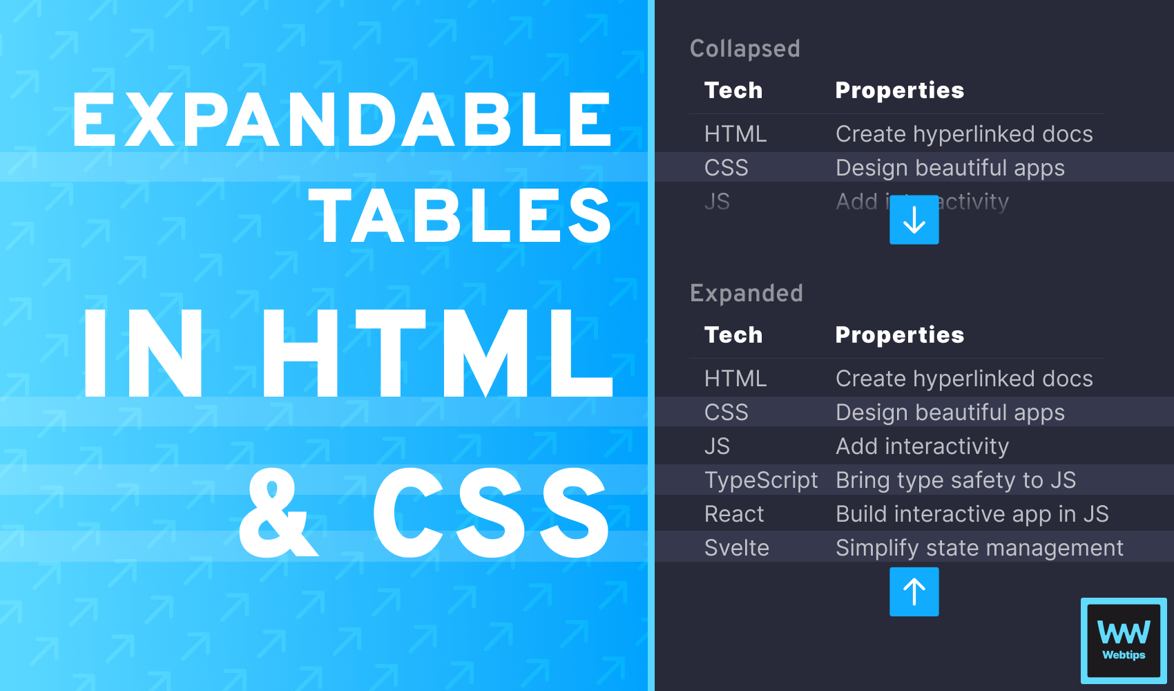
How to Expand and Collapse Tables in HTML Using CSS
5 min read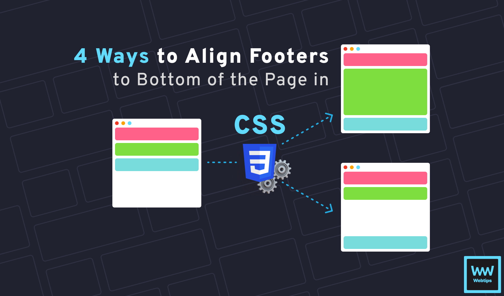
4 Different Ways to Align Footer to Bottom of Page in CSS
4 min readHow to Create Native Interactive Modals in HTML
8 min read