
How to Create a Configurable Tabs Component in React
 11 min read • React v18.2
Tabs offer a versatile and efficient solution for organizing content, enhancing navigation, and improving the overall user experience. Whether you're building a simple webpage or a complex web application, integrating tabs can significantly enhance the usability and accessibility of your product.
In this tutorial, we'll take a look at how to create a configurable (through props) Tabs component in React with TypeScript included. Without further ado, let's jump into coding.
Laying out the Component
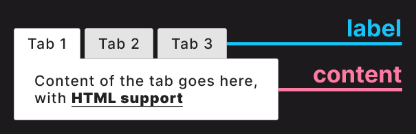
First, let's see how we want to use the Tabs component. It'll accept items and optionally an activeTab prop:
import { Tabs } from './Tabs'

export const App = () => {
    const tabs = [
        {
            label: 'Tab 1',
            content: '<p>Content of the tab goes here, with <b>HTML</b> support</p>',
        },
        {
            label: 'Tab 2',
            content: '<ul><li>Content</li><li>From</li><li>CMS</li></ul>',
        }
    ]

    return <Tabs items={tabs} activeTab={2} />
}
- Lines 4-13: The data for the tabs can be represented as an array of objects. In a real-world scenario, this data would be retrieved from a backend service such as a REST API for a CMS, or from a local JSON file that holds page data. Each tab can have a
labelandcontentthat is displayed under the tab. - Line 15: The data is passed to the
itemsprop, and we can also pass an optionalactiveTabprop that can define which tab should be active by default. If this prop is omitted, the component will default back to the first tab.
label and content properties of each tabBuilding the Tabs Component
Now that we know how the component will function, let's take a look at the component itself. Create a new file called Tabs.tsx in your project folder and add the following code to create the component:
import classNames from 'classnames'
import React, { useState } from 'react'

export const Tabs = ({ activeTab = 1, items }) => {
    const [activeTabState, setActiveTab] = useState(activeTab)

    return (
        <React.Fragment>
            <ul className="tabs">
                {items?.map((item, index) => (
                    <li
                        key={index}
                        onClick={() => setActiveTab(index + 1)}
                        className={classNames(index + 1 === activeTabState && 'active')}
                    >
                        {item.label}
                    </li>
                ))}
            </ul>
            <div
                className="tabs-content"
                dangerouslySetInnerHTML={{ __html: items[activeTabState - 1].content }}
            />
        </React.Fragment>
    )
}Inside this component, we make use of the popular classNames library to conditionally apply class names. Run npm i classnames in your project to install it.
- Line 5: To switch between tabs, we need to use an internal state. Note that the
aciveTabprop is passed to theuseStatehook as the initial value. When we switch between tabs, this state will be updated to the index of the tab. For example, if the first tab is active, its value will be 1. - Lines 10-18: The tabs themselves will be displayed as an unordered list, which better describes their structure than using divs. We can use a
mapto loop through theitemprops to display them aslielements. Don't forget to pass akeyprop for React. - Line 13: To handle tab changes, we can add an
onClicklistener and update the state using thesetActiveTabupdater function. We need to passindex + 1as the parameter because the index starts from 0, but we want to use numbers starting from 1 for the prop. - Line 14: Based on the
activeTabStatevariable, we can conditionally apply an.activeclass on theliusing theclassNameslibrary. This means that whichever tab is active will get an.activeclass. - Lines 20-23: Lastly, the content will be displayed in a
divunder the tabs. To allow the use of HTML tags, we can set the content of thedivusing thedangerouslySetInnerHTMLprop. To get the correct content, we need to referenceitems[activeTabState - 1]. AsactiveTabStateuses indexing from 1, we need to convert back to 0-based indexing by subtracting one from theactiveTabStatevariable.
Adding TypeScript types
The layout of the component is ready, but we're missing the TypeScript types. To add the proper types for the props, extend the component with the following lines:
export type TabsProps = {
    activeTab?: number
    items: {
        label: string
        content: string
    }[]
}

export const Tabs = ({ activeTab = 1, items }: TabsProps) => { ... }We can export the type from the file in case we need to reuse them elsewhere. Inside the type, we have the two props:
activeTab: An optional prop denoted by?. This will be a number with a default value of 1 that is assigned in the parameter list on line 9.items: Theitemsprop is an array of objects. We can define the structure for the object and add[]at the end of the object to indicate it references an array of objects. Both thelabelandcontentproperties are required strings.
Improving accessibility
Although the component is fully functioning at this stage, let's further improve it by adding some extra props on the li element to enhance the accessibility of the component. Currently, users cannot navigate between tabs using the keyboard, which affects usability. We can easily fix this by adding two extra props on the li elements:
<li
    key={index}
    onClick={() => setActiveTab(index + 1)}
    onFocus={() => setActiveTab(index + 1)}
    className={classNames(
        index + 1 === activeTabState && 'active'
    )}
    tabIndex={0}
>The tabIndex attribute makes the element focusable. A value of 0 means the element should be focusable in sequential keyboard navigation, indicating that the focus navigation order is defined by the order of the elements in the document.
Now that the element is focusable via the keyboard, we can add an onFocus event listener, which should execute the same function as the onClick callback. If we use the Tab key to focus on the element, we can now navigate between different tabs. Likewise, we can use Shift + Tab to navigate backward.
 Remove ads
Styling the Tabs
With every functionality in place, there's only one thing left to do: style the component. Create a new CSS file next to the component file called tabs.css and import it into the component above TabsProps:
import './tabs.css'We're going to define the styles related to the Tabs component in this file. To order the tab elements next to each other and style the li elements too, append the following to the tabs.css file:
:root {
    --border: #E7E7E7;
    --background: #E4E4E4;
}

.tabs {
    margin: 0;
    padding: 0;
    list-style-type: none;
    display: flex;
    gap: 5px;
}

.tabs li {
    padding: 2px 20px;
    background: var(--background);
    border: 1px solid var(--border);
    border-bottom: 0;
    cursor: pointer;
    user-select: none;
    border-top-left-radius: 2px;
    border-top-right-radius: 2px;
}For the colors, we can define CSS variables on the :root element to make them available across the project. In a real-world scenario, these variables should be defined in your CSS reset file.
.tabs: The tabs element itself is displayed as a flexbox with a5pxgap between each tab. Also, make sure to setlist-style-typetononeto avoid displaying the bullet points..tabs li: The important parts for thelielements are highlighted. Eachliwill have a1pxborder without a bottom border to ensure it blends with the container below the tabs. Because we don't need aborder-radiuson the bottom, we can target the top usingtop-left-radiusandtop-right-radius. Two other CSS rules can also improve user experience:cursor: Setting thecursorproperty topointercan indicate to users that the element is interactive when it's being hovered.user-select: Settinguser-selecttononeensures that users won't be able to copy the text of the tab. This prevents a flashing caret when the element is clicked.
- Tab 1
- Tab 2
- Tab 3
With the above styles applied, we'll have the above tabs. However, we're still missing the styles for the content and the .active tab, so let's add them next. Extend the CSS with the following lines to add the rest of the styles:
.tabs li.active {
    background: #FFF;
    border-bottom: 1px solid #FFF;
    cursor: auto;
    margin-bottom: -1px;
}

.tabs-content {
    padding: 10px;
    background: #FFF;
    border: 1px solid var(--border);
    border-bottom-left-radius: 2px;
    border-bottom-right-radius: 2px;
}- Tab 1
- Tab 2
- Tab 3
Content of the tab goes here, with HTML support (Tab 1)
With the new rules, we have everything ready for the component to be used. Let's inspect the styles we need for each element to achieve the final result:
.tabs li.active: For both selectors, the last three rules are important. To make the active tab and the content appear as one element, we need a bottom border with the same color as the background of.tabs-content. We also need to set itsmargin-bottomto-1pxto cover the top border of the.tabs-content. A nice addition is settingcursortoautoto indicate to the user that the active tab is not interactive, as it's already in an active state..tabs-content: For the container of the content, theborder-radiusshould only apply to the bottom borders, so we need to usebottom-leftandbottom-right-radius.
Benefits of Using Tabs
With the styles added, we're ready to use the component in new and existing projects. Organizing information into different tabs comes with several benefits:
 Organization: Tabs help organize content into separate sections, making it easier for users to navigate and understand the information presented.
- Space Efficiency: They save space on the UI by hiding content until it's needed, allowing users to focus on the active tab's content without distractions.
- User Experience: They provide a seamless user experience by allowing users to switch between related content without having to load new pages or scroll extensively.
- Clarity and Focus: Tabs can also improve the clarity of complex interfaces by breaking down information into manageable chunks, helping users focus on one task or topic at a time.
Summary
Congratulations! You've just completed the creation of your very first Tabs component in React! Interested in elevating this project even further? Here are some ideas on how to enhance the functionality of this component:
- Add support for using icons
- Implement different variants with different styles
- Add prop for closing and creating tabs dynamically
Are you looking for more React projects? Check out our React projects roadmap, a comprehensive guide that offers inspiration on what to build next and how to approach it. Thank you for reading, and happy coding!

- Access 100+ interactive lessons
- Unlimited access to hundreds of tutorials
- Prepare for technical interviews
Courses


Recommended

How to Create a Responsive Timeline Component in React
10 min read • React v18.2
How to Create Dynamic Routes in Astro
9 min read
How to Work With Event Listeners in Astro
11 min read